Matt has written (or is going to write – ha! my crystal ball!) elsewhere on All About iPhone about the average number of application that users download from the iPhone AppStore. 15, apparently. Maybe I’m unusual then. Because I’ve grabbed over 60. (Out of interest about a dozen of these were commercial and the rest free)
But, and this won’t be news to existing iPhone owners, with all the built-in applications (around 18, depending on model), this makes a total of around 80 applications to organise in some meaningful way.
Is there a fundamental problem with the iPhone application launcher? What’s the best way to keep things organised? And how could Apple improve things? Could they learn something from traditional phones after all?
One of the main sound-bites from the original iPhone launch was that Steve Jobs proclaimed the iPhone to be five years ahead of other phones on the market. All very bold and some analysts like me had a field day ridiculing the statement since it was patently obvious that there were several aspects of the iPhone (camera, connectivity, GPS, apps) which were significantly behind the opposition [two of which got rectified with the iPhone 3G, of course].
But we knew what he meant. Steve was talking about the operating system and interface. Both of which are indeed splendid and futuristic. But that doesn’t mean that they’re perfect yet. Not by a long chalk. And I’m not talking copy and paste again (you’ll be glad to hear).
One of the strokes of genius in the original iPhone was that all the application icons fitted on the one screen. With all other smartphones having between 30 and 60 applications or utilities as standard (go count ’em), the problem for new users was always discovering what their new purchase could do. Some potentially vital utilities (e.g. backup to memory card) were hidden inside a folder inside another folder. Awkward. The iPhone’s system displayed everything it could do. All the time.
And then the AppStore came along, more or less synchronously with the iPhone 3G. And the world changed. never had there been such an easy (and fun) way to discover, buy and install third party applications on a phone. Never. Not surprisingly, everyone and their dog filled their boots with apps – in fact, they continue to fill their boots – I was surprised that Matt’s ’15’ average figure was so low, to be honest.
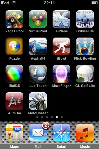
But with 80 apps installed, my nice clean home screen now has a row of dots beneath it. Each one leading to another screen of icons. And another. And another. And I’ve kind of forgotten which application icons are where. And it takes me five screen swipes to even get to icons on the sixth page, which is just plain tiresome. AND when I install a new application, if I want it on the sixth page, I’ve got to do five fiddly icon drags onto the edge of the screen.
Jobs’ vision for a clean home screen has been well and truly hijacked by another of his visions (AppStore).
What a lot of people, including me, try to do is set aside certain screens for games, others for media apps, others for novelties, and so on. But then what happens when the number of ‘games’ exceeds 16 and the icons start overflowing onto the ‘media apps’ screen? You can’t insert a new home screen in between existing ones, it seems, and even the best thought out system is going to quickly start to get rather unmanageable.
The answer, as users of, for example, Nokia smartphones have known for the last 5 years, is to break the ‘flat’ paradigm and introduce folders. So, for example, on the iPhone’s home screen, in addition to several of the usual core applications, there would be folders for ‘Games’ or ‘Utilities’, along with the flexibility to create new folders of your choice on this or any other home screen and then drag and drop app icons into them, to help tidy things up.
Not that I, as a long time S60/Nokia user, would like to say ‘I told you so’, but hey…. A drag and drop folder solution of this kind would be very Apple/Mac-like and could be implemented elegantly. Probably more elegantly than Nokia’s solution, which up until now has had to be keypad/d-pad driven and somewhat cumbersome.
Will Apple go down this route? Or will they wait until Christmas, when the average number of third party apps on each iPhone reaches 100 and we’re drowning in icons whose location starts to make less and less sense. Great apps or no, if you can’t get to them easily then they’re not going to get used.
Over to you Steve.


