OK, I’m full. Now what? Here’s a suggestion…

I started out well with the AppStore, neatly organising my third party applications into categories: games, utilities, reference, music, and so on. No sweat, I thought. A slight problem when I wanted to get from home screen number 1 to home screen number 9, but at least there’s that handy shortcut (press ‘Home’ again) to get back to screen 1 since the last firmware update (2.2).

Then each category started to fill to overflowing. Meaning that applications spilled out onto the next home screen, polluting it. A month later, I’d reached the point where I’d lost control completely, with the first four applications screens now chock full and no blank ‘slots’ in sight for new apps. 

Another month on and all the one hundred and forty-odd app slots are full. And only another 14,950 applications left on the App Store to install. Err…… 

Read on for an (illustrated!) solution to the problem.

OK, as I’ve admitted before, I’m an App Store junkie. BUT. Leaving aside all the novelty apps (e.g. iFart), newsfeed apps (e.g. BGR), ebooks and general waste-of-space apps, I’m still left with the best part of 10,000 applications to grab and try.  But I only have 148 slots on the iPhone launcher and they’re all full. So what now?

I don’t really think even Apple could have predicted that the App Store would be this popular with developers. It’s partly down to the ease of use of Apple’s SDK, partly down to the fact that App Store is on the front page of every iPhone and iPod Touch and partly down to the way every non-malicious, non-offensive app is allowed through by Apple into the catalog. (c.f. the way Nokia draconianly limits entries in their phones’ Download! catalogs to a dozen or so apps from major partners, plus games from just the biggest publishers. Talk about going from the sublime to the ridiculous…) Result? A runaway success.

Numbers-wise at least. You’d think I’d be churlish to complain, but (again) I’m going to anyway. The existing home screen launcher model is broken. And there’s no use simply adding in another 5 or 10 home screens, as the scrolling backwards and forwards would be a nightmare. Not to mention the fact that guys like me would go and fill these screens as well.

Apple seriously, seriously need to implement folders in their home screen system in the next firmware. Being able to have the aforementioned ten or so ‘home’ screens of apps within each folder would completely solve the problem. 

So, for example, you’d have something like this on your main home screen. It might even be your only true home screen:
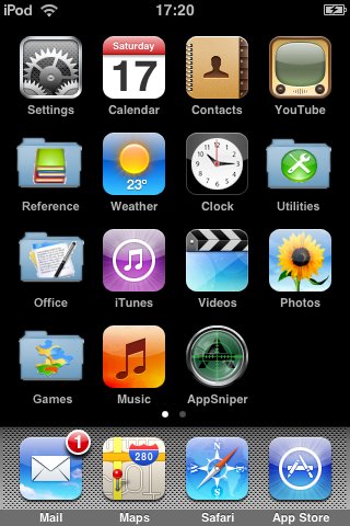
Mockup of iPhone app folders (modelled on the iPod Touch)

Mockup of iPhone app folders (modelled on the iPod Touch)

Regular readers will know I also write quite a bit about Nokia/S60 phones and may spot that the screenshot above looks suspiciously like that from an S60 phone. But you see, the problem of having too many applications for one screen was hit by Nokia many years ago. OK, so they were worried about having between 50 and 100 applications installed on one device, rather than thousands, but the principle’s the same. The solution, again, was folders, just as you’d use them on your desktop computer, to separate out hundreds or thousands of files.

Apple need to eat, I feel, a little humble pie here and abandon the glorious simplicity of the original iPhone home screen, a vision which has become subverted to the point of idiocy by the sheer success of their own App Store creation.

Roll on firmware v2.3 and folders. My device is full of apps and I’m starting to panic!

Steve Litchfield, All About iPhone

  • http://www.fwrnando.com Fernando

    Before clicking the link in AAS I already knew this was going to be about folders.

  • Mobile Observer

    Me too.

  • http://ericherberholz.googlepages.com/ipodtouch Eric Herberholz

    Let’s gang up on Apple, and give them feedback, asking for “Folder” functionality…

    http://www.apple.com/feedback/iphone.html
    http://www.apple.com/feedback/ipodtouch.html

  • Ratkat

    Maybe apple should have a sort of home screen as well, maybe with just five or six shortcuts and show iCal appointments and search and add a to-do function as well.

  • Banglamung

    There was an app for jailbroken iPhones in DevTeam’s “Installer” that worked like folders, allowing one to group apps and have just one icon on the screen. Not sure if it’s stil avaialble.

  • Tim Salmon

    If we’re drawing comparisons with other OS here, the Android front end does this out of the box as well as S60 and I’m not aware of any numbers limit so far.

    Tim

  • http://www.allaboutiphone.net Matt Radford

    @banglamung: you’re thinking of categories, and it’s still available

    I don’t think folders are necessarily the answer. They would break the great thing about the home screens – logical simplicity. Now you would have to think “down” as well as “across” when you’re trying to find your apps. One of the frustrating things about folders, esp. nested folders, is that it can be hard to find stuff squirreled away, layers deep.

    One answer may be along the lines of Springjump for jailbroken phones, which gives you icons that jump you to a specific home screen. If these could be named icons then you’d have the benefit of a quick jump to a named view of applications (which is all folders really are), without the problems of nesting folders and losing things.

    Hmm, I can feel a full post coming on about this :)

  • http://cubeover.aim.com Sergey Zak

    How many of us will “be so full” as to need folders?
    Would few “app junkies” justify to change the default?
    I doubt it. A 3-rd party “organizer” or “launchbar” is all those junkies need.

  • http://www.allaboutiphone.net Matt Radford

    On jailbroken devices you can install Quickgold, which is much like Spotlight on the Mac. It’s a combined searcher and app launcher. It’s great and very quick, but overkill for most users.

  • http://www.gadgetguy.de Frank Koehntopp

    If Apple had been following all the advice like that the iPhone would not have been a success. At all. Let’s face it – the iPhone UI is in a class of it’s own, and that’s one of the reasons people like it. If you want folders, stick with S60.

  • http://www.allaboutiphone.net James Burland

    This is indeed a tricky one for Apple… I think it’s safe to say the Steve’s folder solution would indeed to perfect for some people. But I don’t believe that it’s a very natural solution for most iPhone users.

    As Matt said, “Hmm, I can feel a full post coming on about this”.

  • Bill F

    Folders I cannot see happening but what about an upward flick on each page so that another 16 slots are shown?

  • angryearthling

    ok so i had a iphone 13 days before i gave up on it. i had tried it as a backup device to my ipod and e61i combo which i use every day. my main phone is a nokia e71. hated the limitations and went back to carrying the e61i and ipod 160gb.

    i had about 4 pages of apps (all free) of stuff that i was playing with. however it was very slow to flip through page of apps to get to what you wanted. you could have your top 2 pages of apps but after that it quickly became quite slow to get to what you wanted, that it didn’t multitask so that you could jump to the running app was an annoyance. but this touch to launch interface was done so well on palm with the drop down list at the top. 3 taps would select the list, select the page and launch the app. could easily be added to current interface by apple without breaking the current interface.

  • cordsweat

    @Matt Radford.

    Let’s not make Apple iPhone lovers even stupider by not allowing them to have folders. You said it is simple to not have folders. I ask you, how? Folders are for organization. If you have a particular game, you can put it under the “games folder” and then alphabetize it or sort the games by “accelerometer games” or into, let’s say, a folder called “puzzles”.

    Folders can only add to ease of use. Even if folders existed, it doesn’t mean that the users have to use them. Any phone can benefit from folders as organization, just like computers.

  • http://www.allaboutiphone.net Matt Radford

    @cordsweat

    You’re right – folders are good for organisation, but they’re not necessarily good for finding things. This is especially true when folders are nested, layers deep, and it’s painfully evident when you first turn on a S60 device. Have a read of Rui Carmo’s post here: http://the.taoofmac.com/space/blog/2007/07/21/1312. Specifically point one, where he outlines the complexity of the S60 user interface.

    I think folders break the iPhone’s UI paradigm and introduce a logical inconsistency. The iPhone does a very good job of keeping a simple, flat user interface. Have you read this article on the BBC today (http://news.bbc.co.uk/1/hi/technology/7833944.stm)? Here’s the headline: “The complexity of modern mobile phones is leaving users frustrated and angry”. People find them too difficult already, and I think the frustration is compounded by the small screen size. If it’s fiddly and difficult, people won’t bother.

    This isn’t a S60/iPhone fanboi flame war – we genuinely need to find a way of introducing better organisation into mobile devices, while retaining a simple user interface. This is going to be increasingly important as we store more and more stuff on our mobiles.

    Finally, here’s another article on moving beyond files and folders: http://www.uxmatters.com/MT/archives/000271.php. I don’t agree with the suggested solutions, but the author outlines the difficulties in the file/folder metaphor very well.

  • http://blog.luziaresearch.com Al Briggs

    I think that folders are not needed – this is trying to turn the iPhone / iPod Touch into something it is not. If you want folders get a higher powered device or stick with a S60!

    I think the UI is fantastically simple and I hope that Apple never compromise on that.

  • ares

    I use a combination of categories and quickgold. I created categories for games, tools, fun and multimedia. Besides that I have 4 homescreens. I don’t if apple should introduce folders, but quickgold is a must…I love it. Btw, google app interface is very similar but less powerfull

  • marcol

    I’ve had my iPhone for over six months, it’s my only handheld device and I use five pages of apps. Those five pages have 19 spare slots (so in fact I could get it down to four pages if I chose). I’ve no desire for folders and remember with antipathy the time I spent in S60 looking in folders trying to remember where stuff was. The good thing about Apple’s system is that you frequently flick by app icons and even if you don’t use an app often its icon and position seem to sink in. I never forget where apps are on the iPhone, which is a blessed relief after the E61. If Apple added folders I certainly wouldn’t use them.

  • Carl

    Not sure if you realise, but you can tap the small dots between launch bar and icons to go to a specific page of the home screen.

  • http://3lib.ukonline.co.uk/ Steve Litchfield

    No, on my device, tapping those dots just acts as a single left or right swipe….. Anyone else able to chip in here?

  • http://www.allaboutiphone.net Matt Radford

    @Carl

    Doesn’t work like that on mine. It just acts as a single page left or right, no matter which button you aim for.

  • Carl

    Ok my bad. I have to say that after using an iPhone for 12 months and then using my N73 again, the s60 interface does feel a little draconian. Fortunately this problem will never cause me any issues on my iPhone.

  • J-dogg in T-Town

    I agree with a folder option at least let the high end users have them and leave it optional to use them or not then the people who love their easy to use iphone can still flick there way through 9 pages of apps and high end users can add folders and sub folders till their hearts content, its a win win!