 I’ve never been a sports fan. To my mind, they’re like games shows on TV – you’ll see the same thing each time except that sometimes they win at the end and sometimes they lose. Why would you ever watch it twice?
The one exception for me is Formula One. Even for many sports fans, a liking for F1 is baffling when the sport can often be summed up as “cars going around in circles”. There are Cricket fans who yawn at the prospect of watching it. Even as a fan I recognize that it can very often be a predictable and tedious procession. So what’s the attraction? Well, I don’t really know but, based on my experience, I do have a theory.
I never had any interest in F1 until I happened to find myself in a job where I was involved in the sport in a peripheral way and, almost against my will, I absorbed a lot of knowledge. An unexpected result of this was that even after I stopped doing that job, my interest in F1 continued.
Here’s my theory as to why. I suspect that if you learn about a sport, then at a certain point you’ll know enough to have a reasonable attempt at predicting what might happen. At that stage, you’re hooked as you’ll be motivated to watch the event and see if it turns out the way you expected. So, if I’m right, it should follow that any source of information on a sport, especially when it’s presented in a palatable way, should help to win over new fans as well as satisfying current aficionados.
And that brings me to ‘Go Go Go! – GPXL’s Guide to F1™ 2009’ by Gourmet Pixel. In the words of its own blurb on the App Store, this app “brings a huge amount of information about this years Formula One season to the palm of your hand”. It also, rather misleadingly, says “Great app for fans of auto racing, NASCAR, MotoGP, WRC, IndyCar and especially Formula One™.” Well, from what I’ve seen, it’s exclusively F1 facts, figures and news that the app provides. Fans of the other types of motor sport should look elsewhere.
 First Impressions
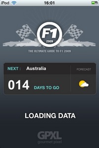
The first impression of ‘Go Go Go!’ is very impressive with a very nice, slick graphic design. When the app starts, it performs a check to download new data and while it’s doing it, shows the number of days to go until the next race and a weather symbol for the location. Whether it’s showing the current conditions or a forecast for the actual race date is left to the user to guess. Once the app has downloaded any updates you can move into the main area.
Appropriately for a sports based application, this is an app of two halves. On the one hand it contains what you might call ‘background’ information on the main F1 areas while, on the other, it also shows changeable data such as news items, championship tables and videos.
Driver information
The background information is divided up pretty predictably into sections on Teams, Drivers and Races. Tapping on the Driver’s category shows a listing of the current crop, and tapping on an individual brings up a screen with much of the data you’d expect. Date of birth, F1 stats, biographical information and so on are all present and (largely) correct. Though there’s unsurprisingly a photo of the driver in question, a graphic showing his helmet design and car number would be more useful to help identify individuals during a race.
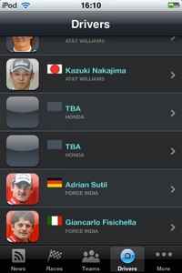
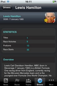
It’s here I started to spot errors in the data. Veteran driver Rubens Barrichello’s name is listed on one screen as ‘Barruchello’ and ‘Barrichelo’ on another. Also, both Rubens and his team mate Jenson Button aren’t listed in the main screen and don’t have photos.
 Team and track data
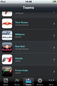
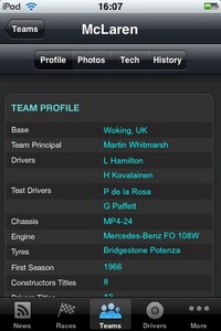
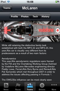
The information provided for the Teams is a little more wide ranging and gets divided up into separate screens showing a Profile, Photos, Tech and History. Another obvious problem is visible here, the recent change from Honda to Brawn GP. Although rather a vital piece of information in the Formula One world, this change isn’t reflected in the app. The Team is still called Honda in the team’s section and no mention is made of the change in the team’s history. This also accounts for Jenson and Rubens missing data in the Driver section.
Why is this data not up to date? Either it’s hard coded into the app and will require an update to fix or the changes are yet to be updated on the developer’s server. The former problem suggests a lack of foresight (the problems with Honda have been known about for months so why hard code it?) and the later suggests a degree of tardiness that doesn’t bode well for accurate and timely data updates when the season starts.
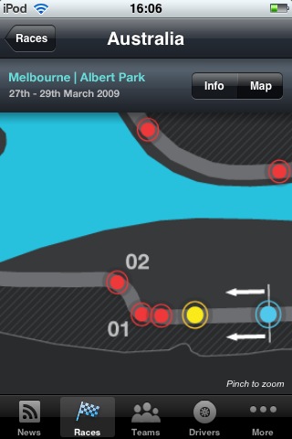
The section on the races shows the timetable for the race weekend, a few choice stats and a map of the circuit. Beyond being able to zoom and pan around the map it feels like it should do more for some reason. You feel as though tapping on a corner should display the speed and gear perhaps but it doesn’t. 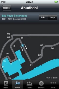 A few more errors are to be found here too. All maps have a (somewhat dubious) racing line drawn on except Melbourne and (more understandably as it’s new) Abudhabi. Less forgivable is the Abudhabi track being called ‘São Paulo Interlagos’ at the top of its screen.
Read all about it
But the screen you’ll be using most is the ‘News’. This shows a list of recent stories with a tap opening the selected one and showing the details. Although the source is credited, for some reason it isn’t a live link so if you want to follow the story in more detail you’ll have to manually fire up Safari and type the link in yourself.
Even though the news items are updated daily, there currently doesn’t seem to be more than half a dozen or so per day at most. This is a little odd considering the number of web sites out there catering for F1 news plus team and official FIA press releases and so on. Perhaps more will appear once the season starts.
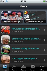
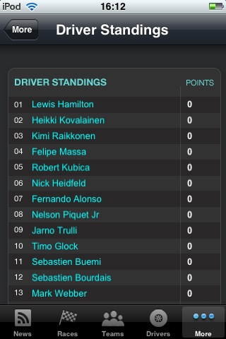
As well as the lack of links to the sources of the news stories, it would be nice to see a bit more connectivity between the different pages of the app. A link to all McLaren related videos from that team’s page for example. Also, tapping a driver’s name in the championship table view linking you to the drivers profile page would be good as would a link on his profile page to his official website. This isn’t a paper book, it’s an interactive software application on an internet connected mobile device so why doesn’t the app include any live links like this?
Videos
The final section of interest is the video page which is rather tucked away in the ‘More…’ view. A number of videos are listed here though most currently appear to be PR pieces released by the teams or their sponsors. It’s hard to know as their sources aren’t made clear. Knowing how tightly actual race footage is controlled by the FOM, I suspect anyone hoping for race highlights once the season is underway may well be disappointed. The videos are quite heavily compressed presumably to enable streaming so an option to download higher quality versions would be welcome.


Conclusion
A slick looking interface doesn’t do much to compensate for rather patchy information. These are mainly rather trivial errors in themselves but in an app that purports to act as a reference, obvious errors like these knock your confidence in the rest of the data.
Even assuming the data relating to the Honda change will be corrected shortly, other errors make you wonder what kind of checking and QA is being applied to the app. I can only assume it’s ‘precious little’ based on my experience. If that’s the level of accuracy and speed of updates that occur now, what will it be like when things are changing by the day and even by the hour once the season starts?
Though it’s difficult to judge the app’s performance when it’ll be at it’s potentially most useful, i.e. during the F1 race season, I’m left wondering what the point of the app is. On what occasion would having this application in your pocket be an advantage? Any F1 fan would be watching the races so results would rarely need to be looked up in this way. Any other information such as a Driver or Team details would be more reliably found on the web. Even breaking news, an area where the app could best justify it’s existence is better dealt with on the web and most fans would be best served by simply using their iPhone to view one of the many excellent Formula One websites. Perhaps if it incorporated a fantasy F1 game or something similar, having all the data to hand might make more sense and be more meaningful. But it doesn’t and it isn’t.
I think it’s telling that while I was coming to the end of this review the developer changed the name of the app not once but twice from ‘F1 2009 – The Ultimate Guide’ to ‘F1 2009 – GPXL’s Guide to F1™ 2009’ and finally to ‘Go Go Go! – GPXL’s Guide to F1™ 2009’ . It’s difficult to dispute that it’s a guide to Formula One but ultimate it certainly is not. Also, the sudden sprouting of a number of trademark symbols in the app’s title and description text does little to alleviate a concern I’ve had from the start. When you’re dealing with an organization that trademarks the term ‘F1’, use of its data is a very carefully controlled area and I have wondered about the apps legal standing. Specifically, whether it would continue to exist and be updated for the duration of the season. A few TM symbols scattered about doesn’t completely ease my concerns but at least it shows the developer is slightly more aware of the issues than it seemed previously. Let’s hope this won’t prove to be a concern for anyone purchasing this app on the assumption it will last until the end of the season.
So, as an F1 fan, will I be using ‘Go Go Go! – GPXL’s Guide to F1™ 2009’ to keep up to date with the Formula One news? Well, although I intend to check it out again once the season starts, at the moment I have no reason to change my usual routine of visiting my favourite F1 news website and watching the races.
I’d be reluctant to recommend this app if it was free so considering it’s priced at £3.99 I can only strongly suggest you see it in action before parting with your cash. Disappointing.
Go Go Go! – GPXL’s Guide to F1™ 2009
Version reviewed: V1.0
Category: Sports
Developer: Gourmet Pixel
Price at time of review: £3.99
Works on: iPhone & iPod Touch
UK App Store Link
