 Some apps seem ripe for the iPhone: games, Twitter clients, podcast players and many others. Who though, would think to create an application that contains several of the essential photo manipulation tools found in more grown up software like Photoshop? GhostBird would… and did.
With PhotoForge, you effectively get two apps in one. It’s an image manipulation utility and also a painting app. Although I suspect the developers see the image manipulation side as the main selling point, for me, it’s the painting aspect that’s of most interest. I’m not suggesting its bad at twiddling with your photos, it’s actually very good at it and includes an impressive range of tools. It’s just, for me, it suffers from an inherent problem regarding photo editing on the iPhone. But I’ll come to that later.
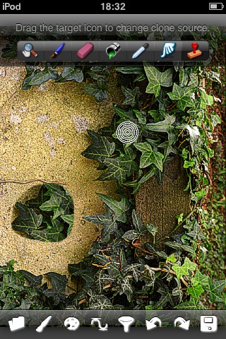
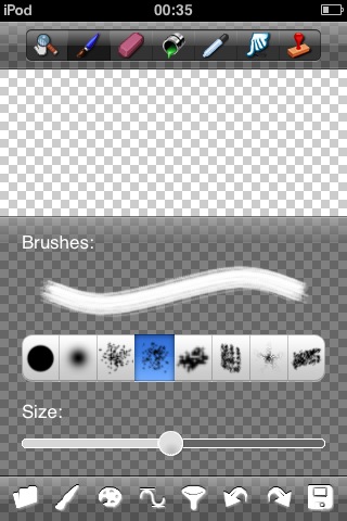
 The opening screen (indeed, the only one) gives the first clue that this isn’t your average paint app. Rather than being presented with a blank white page, the background shows the chequer board pattern familiar to anyone who’s ever used Photoshop – the ‘paper’ is transparent. Along the top of the screen are the tool selection icons: Pan/zoom, Paint, Erase, Fill, Colour Picker, Smudge and Clone. Along the bottom of the screen are mainly the edit tools: Open/new file, Adjust brush, Select colour, Curves, Filters, Undo, Redo and Save.
I’ll deal with the dual aspects of the app separately, starting with the Photo side of things.
Photo Editing
Loading a photo is easily done via the Open/New icon. Selecting the ‘Open’ option sends you off to the familiar Photo Albums screen where you can select any image currently stored on your device. Loading a landscape shot may throw you at first as it appears in the portrait orientation, clearly done to better fit the image on screen. This is fine except the toolbars (as well as the dialogues they activate) remain in their portrait position at the top and bottom of the screen. This means much awkward turning to check the results of an edit or trying to deal with the interface at 90 degrees. There’s certainly room for improvement here.
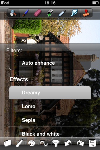
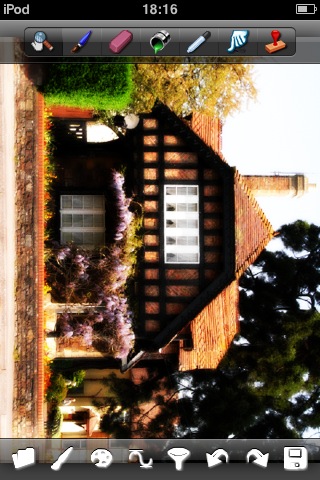
Once your image is loaded, it’s time to delve into the various tools and filters available for tweaking your photo. As I mentioned before, some of these are surprisingly sophisticated. You get such things as Curves, Clone stamp and Unsharp mask. Also available are a range of 21 filters including Sepia, Heat Map, Emboss, Blue Sky and my personal favourite, ‘Dreamy’ which softens and blurs an image giving it a romantic ’chocolate box’ effect.
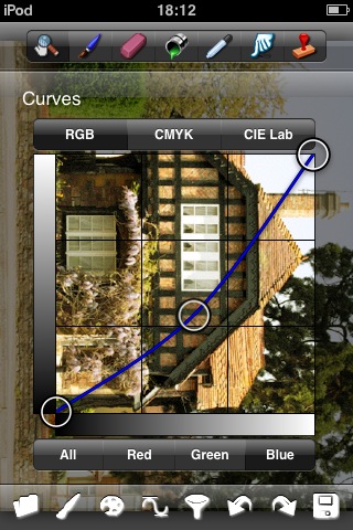 It’s the top end tools such as ‘Curves’ that give this app the feel of a pocket Photoshop. Not only can you adjust the image in its native RGB (Red, Green, Blue) ‘Colour Space’ but you can change it to print friendly CMYK mode – amazing in an iPhone app. Given the sophistication of these tools, there are some odd omissions. You don’t get a simple crop function, hue/saturation controls, dodge/burn or the ability to rotate the image. I have to be careful here. It’s easy to see such things as Curves and automatically wonder why other Photoshop style tools aren’t included but I have to remind myself this is an iPhone app and can’t possibly contain as full a feature set as Photoshop. Even taking this into account, the lack of a couple of basic functions just seems plain odd.
Using the tools is a straightforward process. They behave as any experienced user would expect but the lack of a manual will lead to many experimenting randomly, getting frustrated at the results and giving up. This lack of documentation leads me to another point. I get the feeling there’s more to the app than I’ve managed to find but lacking a manual, the user is left to their own devices. For example, in the Curves tool, you add a point by tapping on the spline and can then drag it around. I have a feeling you should be able to delete points too but can’t figure out how. Now, perhaps I’m just projecting my experience with Photoshop onto the app and I’m looking for a function that simply doesn’t exist but is it my problem or the design of the app? I’m honestly not sure.
In fairness, the PhotoForge section of the developer’s website does include a ‘Tutorials’ page but, at the time of writing, it only contains the words ‘Coming Soon’. Let’s hope it’s filled with comprehensive and easy to follow instructions before too long. It would be better, however, if the app also contained help.
Actually using the various tools to tweak an image works as you’d expect. Slider’s become unresponsive too many times for my liking however, leading to several useless swipes before it will budge. On the whole though, it works very nicely.
Filters & Effects
In practice, you’re likely to find some effects and filters work very well for one image while ruining another but that’s the nature of this type of work and you’ll start to identify what effect suits which type of image as you practice. For example the ‘Blue Sky’ filter will help most landscape photos, making it look like a sunnier day but it’ll ruin other types of shots and just add an odd blue band across the top.
Some of the effects are made somewhat less useful by the fact they can only apply to the whole picture. They’d be much more effective if you could apply them to only certain parts of the image but selections don’t feature in PhotoForge. If the developer could find a nice way to implement them, it would dramatically expand the possibilities available to the user.
The app makes you happy to experiment as it includes nicely implemented undo and redo functions. It’s possible to quickly undo several steps but go one step beyond that and you’ll be staring at a ‘Processing’ box for a few seconds. This comes more into play when you start painting as editing photos tends to be a one step at a time kind of operation rather than the rapid successive strokes you make while painting.
So, PhotoForge does image manipulation very nicely, providing a number of grown up toys to play with. And oddly enough, that’s what puzzles me about this app. Whether you actually have a use for what amounts to a miniature version of Photoshop in your pocket is questionable. Try as I might I cannot think of a circumstance when I’d need or want to manipulate photographs on my device. You certainly wouldn’t transfer photos produced with a better camera onto your iPhone to edit, you’d do it on your desktop, with more fully featured software and a larger screen.
Presumably then, the idea is that you can manipulate the photos taken on your iPhone before emailing them off to friends and family. Again, I’d suggest that’s best done after transferring them to your PC to edit. So, that only leaves us with times when you take photos with your iPhone and absolutely, positively have to amend and send them before you get back to your computer. Personally, I never need to do that but perhaps others often do?
Painting
 Painting, on the other hand, is something I think is perfect for the iPhone and Touch. Without having to cart around an easel, canvas, paints, brushes and water, you’re able to create a sketch or mini masterpiece whenever the mood takes you. Whipping out a single, pocket sized device provides easy access to all the tools you need without the hassle of tucking pencils and pads under your arm every time you leave the house.
It’s possible to load a photo and paint over the top but the more usual method will be to create a new project starting with a blank screen. The only options in PhotoForge concern the size of the image you work on. There’s the choice of 640, 800, 1024 and 1600. I opted for the largest size as most people will but I was surprised to find my resulting images appear as 560×801 once I’d checked them on my PC.
With a blank page facing you, you could select a colour and use the Fill tool to get a clean blank page to work on but I preferred to keep the transparency, adding colour as I worked. Any parts of your canvas still left transparent when it’s saved, appear white when viewed as a JPG.
Maybe it’s my Photoshop experience coming to the fore and it might just be a little too ambitious but I’d love PhotoForge to have layers. Even a couple of layers would be highly usable, sketching on one layer and painting on another. It has to be said that even as it stands, PhotoForge is extremely usable as a Painting app.
The right tool for the job
Many of the features meant for Photo manipulation such as Curves, Unsharp Mask and so on are left unused when painting, while others like smudge and brushes suddenly play a starring role. Selecting different tools is very quick and simple but I found myself wishing the app had a bit of ‘auto tool select’ intelligence to speed things up. For example, while you’re painting you’ll find yourself selecting a brush type, changing its size, choosing a colour and want to paint. Most of the time, you’ll find you have to then select the Paint tool again. Surely, 95% of the time you change a brush or choose a different colour, the very next thing you’ll want to do is make a stroke so shouldn’t the Paint tool be automatically selected? I have to say that I quickly got into the swing of reselecting the Paint tool each time and found it didn’t slow my progress or frustrate me too much but a small usability tweak here would pay dividends to the work flow I think.
 Several types of brush are available though I found most too similar to be worth the trouble of selecting. As well as choosing a type (i.e. a brushes ‘cross section’), you change its size with a slider. If the app included the ability to select an area, it would be nice to add your own brush types (from marks on a canvas) but currently this isn’t possible.
Drawing a curved stroke hi-lights a problem common to most painting apps. The curve appears ‘stepped’, presumably because your finger moves faster than its position is tracked by the processor. What’s needed is the approach some others have taken by turning the stroke into a spline which smooths the line out. Having said that, I found I got around the problem simply by making shorter strokes where the stepping was less noticeable. I would prefer the smoother lines though.
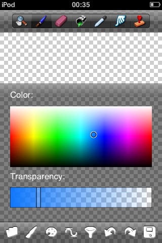
Colour’s selected by tapping somewhere on the palette and dragging a bar to alter its opacity. I found this surprisingly useful. Very often you’ll want to have a colour (a skin tone perhaps) that is your base then be able to select subtly different tones to act as highlights and shadows around that colour. As the colour palette’s quite small on screen it’s very tricky to make those tiny changes so using the opacity slider becomes a boon for finding the ‘neighbour’ hi-light and shadow tones. If the colour palette were larger, it would make selection a great deal easier. Also, being able to make colour ‘swatches’ would be a helpful addition. You could just select a mid skin tone, make it a swatch and change it subtly for a highlight or shadow, while always having the base tone to go back to. You’re currently able to do something similar, using the colour picker but it’s not quite as easy a way to do it.
Colour pickin’ good
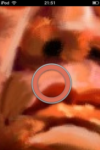
The colour picker is worthy of praise. Select it, tap on the screen and a ring of colour is displayed around your fingertip. Move your finger over the picture and the colour changes as you go, showing what you’re selecting. This does hi-light an inherent problem with drawing on the screen though. By definition, the area you’re painting is obscured by your finger. In practice, although it could be a pain at times, it didn’t interfere too much with my progress. A nice addition would be an optional system to show the area being painted, similar to the magnified area that appears in other apps when editing text.
 Panning and zooming the image is a very common action. Currently you have to select the Pan/Zoom tool, use it then tap on your next tool before carrying on. Couldn’t the panning and zooming be handled without having to select it? If the app recognised a pinch it could zoom accordingly and a two fingered double tap could zoom the image back to full screen. Also, why not use a two finger drag for panning? Considering how often these actions are performed during painting, cutting out the need to select and deselect the Pan/Zoom tool would make a big difference to the speed of painting. Talking of panning, it can be awkward to edit near the edge of the screen as the page bounces back in the familiar iPhone way so the edge of the paper aligns with the edge of the screen. It would be better if this behaviour was turned off when zoomed in.
That all said, in practice, I found painting a surprisingly pleasant experience with PhotoForge. For me it’s continual round of pan/zoom image, select colour, adjust brush and paint (with the occasional undo to break things up) soon became second nature.
While you’re working on a painting, the project seems to be saved in the apps own format between sessions. If you press the home button to quit PhotoForge while you’re in the middle of a painting and later, run the app again, the image is not only loaded but the transparent areas of the screen remain and even the undo buttons will work, deleting strokes made at the end of the previous session. This is a nice way to do things but I wish it was possible to save images in that format so you could switch between paintings while retaining the unfinished project’s features. If you save an image (whether it’s an edited Photo or painting started from scratch in the app) it gets saved to your ‘Saved Photos’ folder as a JPG file for you to view and email to yourself as normal.
Unexpected results
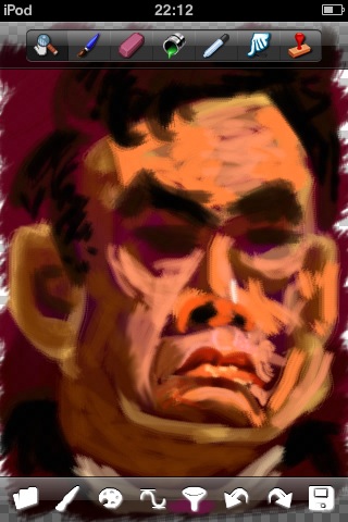
I was surprised at the results of my painting with PhotoForge. My natural painting and drawing style is very ‘tight’ and realistic but I found that the results from PhotoForge were far more ‘loose’ and painterly than normal. Take a look at my caricature of Gordon Brown below (in case you were wondering who it was meant to be). While I’m not unhappy with this result, I’m at a bit of a loss to understand how it happened. My assumption is that this is mostly down to the thick strokes I used rather than the thinner ones I’d normally choose with other media.
Although PhotoForge doesn’t pretend to be a natural media application like Corel Painter on the PC and Mac (which replicates traditional media from watercolour to pastels), using the textured brushes gives a passable impression of oils with the resulting image looking nicely painted if a little soft.


Verdict
I can’t, for the life of me, imagine needing to edit photos on my iPod Touch (or even an iPhone if I used one) and certainly not to the level that PhotoForge allows. But don’t let my inability to see a use for the photo manipulation tools put you off. If you want them, rest assured they work as advertised, allowing you to make changes to your photos that would previously have required you to wait until you got back to base.
As impressive as many of it’s photo editing features are, for me it’s as a painting app that PhotoForge shines. It’s reassuring to know that if I find myself out and about and get the urge to sketch something, I’ll have all the tools I need without the bulk of traditional media. It’s not perfect of course – there are a number of new and tweaked features I’d like to see but even as it stands PhotoForge is a well put together and professional image manipulation and painting app.
PhotoForge
Version reviewed: V1.1 (‘V1.1’ in the app store but the app displays ‘V1.5’ when installed)
Category: Photography
Company: GhostBird Software
Current Price: £2.99
Works on: iPhone & iPod Touch
