 I have a particular interest in painting apps and, as I mentioned in a previous review, I think the iPhone is a great platform for this type of application. Portable and lacking the mess of real media, a good painting app offers Artists of all levels the chance to create wherever they find themselves without the need to carry around all the equipment and materials they’d normally use.
Discounting the dozens of simplistic finger painting applications out there, you’re left with three main contenders for the title of the best painting app: Brushes, PhotoForge and now Layers. I’ve not tried Brushes as yet but have already reviewed and been impressed by PhotoForge. New kid on the block, ‘Layers’ really needs to add something different and impressive to the mix in order to have a chance of standing out.
The ‘Unique Selling Point’ of Layers is, unsurprisingly given its name, the inclusion of layers (I’ll stick to the convention of referring to the app with a capital ‘L’ as opposed to the feature that’s all lower case). I’ll take a look at this in detail later but start with the more conventional elements of the app.
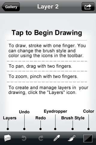
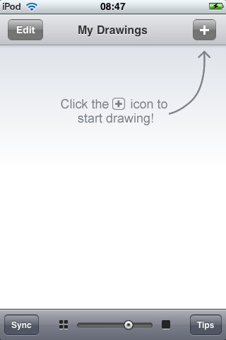
The first time you run Layers, you’re given a few pointers as to how to get started and where to find the tools, which is a nice touch and the first indication of the thought that’s been put into the design of this app. The first thing you need to do is press the ‘+’ button to create a canvas to paint on. This takes you to the main screen where you’ll spend most of your time. This has the painting area in the middle with toolbars appearing along the top and bottom of the screen. On top is a button leading to the Gallery view (where all your work can be seen, loaded and erased though not re-ordered which would be a nice addition), the name of the layer you’re working on and, to the top right is the export button.
Along the bottom of the screen are the paint tools. Here you’ll find a button to the layers view, undo, redo, colour picker, brush screen and colour selection. I think there’s a button missing here as I’d like to be able to quickly select the eraser tool. At the moment, this is combined into the colour screen but having one click access to it while you’re painting would be useful. This would require a slight design change and my suggestion would be for one tap to enable/disable the eraser and brush tools with a double tap moving you into their settings screen.
 Colour selection
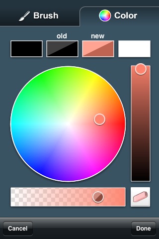
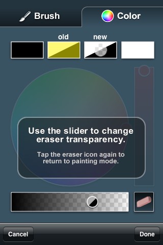
On opening the colour screen, you’re presented with a colour wheel covering all the hues of the rainbow. To its right is a saturation slider (colourful at the top and monochrome at the bottom). Above the wheel can be found four boxes. The two on the ends allow quick access to black and white while the two in the middle are labelled ‘old’ and ‘new’. The old/current colour appears in the left box and the colour you’re selecting to its right. I was puzzled by these boxes for a while, wondering why they were divided diagonally in two. Luckily for me, the developer, Ben Gotow, was kind enough to offer to answer some questions I had while working on this review so you’ll find a few of his responses to my queries scattered through this piece. On this occasion, he explained that the diagonal cut allowed the app to show the colour against a light and dark background.
That effect depends on how transparent the colour is. Completely opaque and you just see the full-on colour. Any degree of transparency, though, and the background starts to affect the result. All in all, a useful touch. The transparency of the colour is controlled with the slider at the bottom of the screen. Fully opaque on the right and transparent as glass on the left.
One small annoyance is the fact that when you pick a new colour using the colour picker, the transparency level is reset. The natural assumption is that if you’ve set, say, 50% transparency and then change colour, that it will remain at 50%. In fact, the opacity is reset to 100% opaque. Not the end of the world but it would be better if the app didn’t act in this counter intuitive way.
 Eraser
To the right of the transparency slider is an icon for the eraser tool. Pressing it turns off most of the screen’s colour related controls and converts the transparency slider into the control for the strength of each eraser stroke. In an app that is otherwise so well designed, this really stands out as a cumbersome and unnecessary attempt to simplify the controls by shoehorning them into the minimum space. This does lead to a couple of less than ideal results. For example, the eraser bar goes from fully opaque to fully transparent which translates to 100% erase to 0%. Why would you want an eraser that erases nothing? Also, every time I used it, I found myself having to guess which end of the bar was which as it’s not obvious. Giving the eraser its own settings screen (accessed with that new Eraser icon on the main toolbar I mentioned) would be better in my opinion.
Don’t get me wrong, it isn’t a deal breaker by any means but just feels to me that combining it into the colour selection screen is one piece of simplification too far. Not only does it add a little complication (and possible confusion) to the colour selection screen but it makes the eraser tool an extra click away.
 The Brush screen
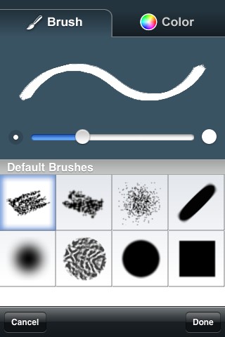
The Brush screen presents a much simpler set of controls to the user and can be accessed either by pressing the tab visible at the top of the Colour screen or via its own icon on the toolbar. Here you can choose between eight different brushes and adjust its size via a slider. Tapping on the icons to the left and right of the slider adjusts the size by small, precise amounts – not something I found of particular use but another nice feature.
One thing of note here is that the brushes are labelled ‘Default Brushes’ which suggested to me that they might be adjustable. It turns out they are not but the developer informs me that the potential is there (in a future update if it proves popular) for users to load in new sets of brushes. Personally, this wouldn’t be a high priority for me – there are one or two other features I’d like to see before I’d want additional brushes.
Colour Picker
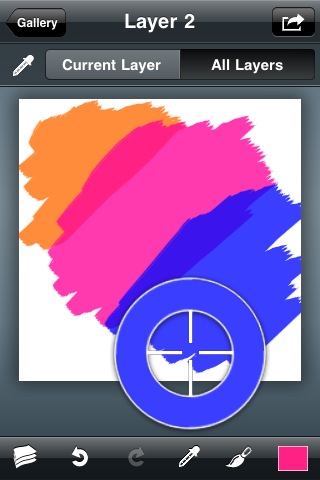
The final painting tool on the toolbar is the colour picker. There are two ways of activating this. Pressing the icon brings up the selection ring which you drag over the painting until it reaches the colour you want. This also allows you to choose between acting on the current layer or all of them. The other way is simply to tap and hold your finger on the painting for a few moments and up it pops. This works very well except for one small but annoying detail. It takes just a bit too long before the ring appears. This sounds trivial but soon gets quite aggravating.
 Enough of the tools, what is it like to paint with?
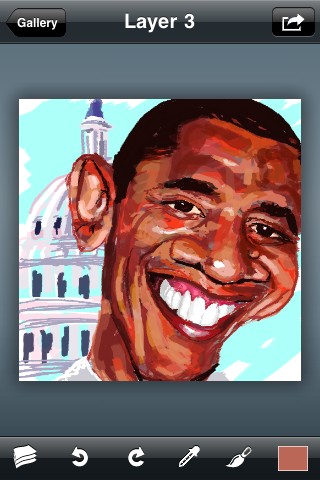
The first thing to note is that I found it odd painting a square picture which the only choice of ‘canvas’ you get. In no other circumstance can I recall doing that. Every other drawing or painting I’ve worked on has been done using the more conventional proportions which gives you the choice of working ‘portrait’ or ‘landscape’. Square just feels wrong (if for no other reason than it doesn’t make best use of the screen space on the iPhone) and I’m at a loss to understand why it was chosen. The developer tells me that the option for the more conventional shape is likely to appear in a future update. The resolution of the painting is also a bit low although not so much that it feels inhibiting. Detail can still be added and the resulting image will (with a bit of skill) be something you’d be happy sharing with others.
When I looked at PhotoForge, one of the minor annoyances was having to manually switch the pan and zoom tools on/off. Layers improves on that greatly by allowing the user to access these features via gestures. A pinch zooms in (up to 1000%) and out with a double tap quickly zooming in (to 200%) or out (to view the whole picture). I did find that when I attempted to dab a few brush marks on, it would occasionally be read as a double tap and the picture would zoom when I didn’t want it to. It wasn’t long though before I got used to simply slowing my dabs down to stop this happening – a price I was happy to pay for easy zooming. Finally, a two finger drag pans the canvas around. These controls work very well although at first I did find that the occasional pan gesture would confuse Layers and lead to an unwanted brush stroke. I found that spreading my fingers out a little (as opposed to keeping them together) fixed this problem.
During my painting, I did find that I wanted some indication on screen of the size of the brush. There’d often be times when I’d be doing something between strokes (changing colour, zooming, changing layers or whatever) and forget the size of brush I had. I’d then either need to try it and possibly undo if it wasn’t what I wanted or go into the Brush screen to check. An indication on-screen, perhaps with a circle around the brush icon whose size suggests the brush width, would be helpful. I also found that I’d generally alternate brush sizes between a thin, detail brush and a larger, more general size. Perhaps there could be some way to easily switch between the two in future but I have to admit I don’t immediately have a good suggestion for how to implement that.
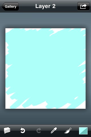
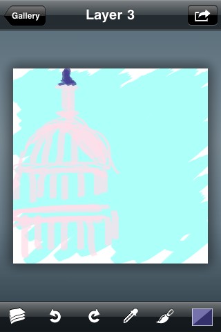
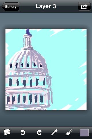
When you paint, the toolbars slide off screen to maximise the viewable area and return when you pause from painting. But, just like the time taken for the colour picker to appear, it’s takes a little too long for the toolbars to reappear. Again, this sounds trivial but quickly becomes frustrating. There is already a way to force the toolbar to return and that’s with a shake. I’ve never been a fan of the shake on the iPhone. It seems too physical and different from the usual gestures and I find it really brings me out of whatever I’m doing. It should be said that it doesn’t require a full shake in Layers but merely a twitch of the wrist. Even so, a tweak of the time required for the toolbar to come back would be preferable to the RSI inducing shake control. I’m happy to say that the developer has taken note of my (and others) comments on this and plans to take a look at it.
I also found that when I tried to draw a slightly curved line, it would be drawn straight more often than not. I’d imagine this is a limitation of the screen resolution (i.e. the hardware) rather than Layers.
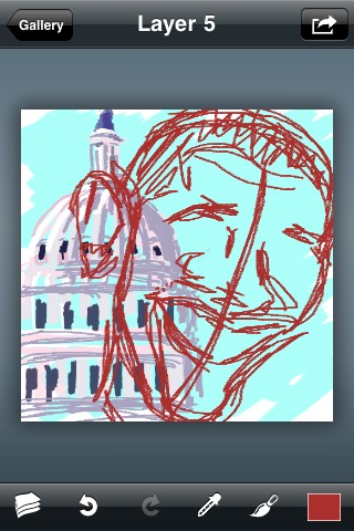
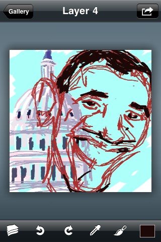
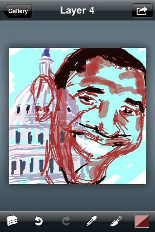
In case it seems I’m being overly critical, I should explain that most of my suggestions for changes are just small improvements to enhance already adequate features but one tool that is just plain missing (and Layers is crying out for) is some kind of smudge or mix tool. A good percentage of the strokes I made during my painting in Layers was an attempt to smooth out the transition between two areas of colour. A smudge tool would not only make this much easier but vastly cut down on the time needed to paint. I’m convinced the painting I created using Layers would have taken something like 75% of the time using PhotoForge (which already incorporates a smudge tool).
Natural Media?
On its web page and in the App Store, Layers is described as a ‘natural media’ painting application. I really hope the developer changes this as, despite its many fine points, Layers cannot be described as a natural media app. It doesn’t replicate the behaviour of real world media such as oils, watercolour, pastels etc so the description is a little misleading to say the least. Ben, the developer tells me he used this language as it’s used by his main competition, ‘Brushes’. While I understand the reasoning, I can’t help but think that two wrongs don’t make a right and hope the description is changed for Layers (and Brushes) to make it less misleading – after all, there’s plenty to boast about with Layers without making dubious claims.
 Exporting
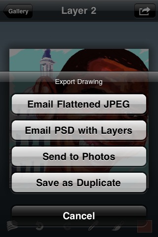
When you’ve finished your picture you’ll probably want to get it off the iPhone and into the real world. Pressing the export button located at the top right of the painting screen (seems odd that it’s not in the Gallery view), brings up several options. Emailing a Photoshop ‘PSD’ file (which keeps the layers intact) or a flattened JPG directly from the app results in a picture with a resolution of 512×512 but saving it to your Photo collection and then emailing from there gives you a 800×800 file for some reason. The best way to transfer it seems to be via the ‘Sync’ option (which is located in the Gallery screen). This requires you to have installed the ‘Layers Replay Viewer’ application, available free. As it says on the website, with this you can “replay your work, export paintings as high-resolution JPG and Adobe Photoshop files (up to 4096px x 4096px), and create QuickTime movies for sharing online!” I’m unable to try this as it’s currently only available for Macs. Happily, the developer is planning to create a web based method giving Windows users a way to output high resolution images.
Finally… layers
The headline feature with Layers is, as mentioned before, the inclusion of layers. While I wished for them when reviewing PhotoForge, I thought I was probably being a little too ambitious given the limitations of the platform and interface. Also, I had a feeling my desire for layers may have been at least partially down to the similarity of some of PhotoForge’s features to Photoshop which would naturally lead me to think of layers as it’s such an integral part of Adobe’s famous desktop application.
For anyone unfamiliar with the concept of layers, they can be thought of as a pile of transparent sheets you can paint on. When viewed from above the different elements appear to be painted on one combined sheet. These sheets can be reordered, deleted, created and selectively glued together (or ‘merged’). The obvious use for layers in a painting app is to paint different elements onto separate sheets, the background on one, the mid ground on another and the main subject on a third, for example. Also, you might sketch out your initial idea on one layer and paint onto another. This flexibility encourages experimentation on a grander scale than the undo function does alone. Whole areas can be easily changed or discarded without disturbing other parts that you’re happy with. For example, while painting a portrait, you might be unhappy with how you’ve done an eye and try painting it again using a new layer. This gives the option to accept the new version and merge it down into the main painting or delete it with no damage done.
Well, that’s the theory but how has the idea been translated for use on the iPhone? The short answer is amazingly well.
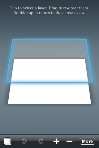
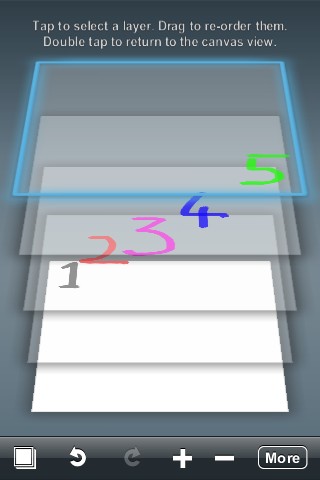
When a new painting is started, you are given two layers. The bottom one is already filled with white and by default, you draw on the next layer up. You can, if you choose, change the ‘paper’ colour or even erase the colour entirely although it’s a little difficult to see that. If the traditional Photoshop chequer pattern appeared ‘under’ the bottom layer it might make things a little clearer. This is a possibility for a future version of the app.
You are limited to a maximum of five layers but in practice, with a little forethought, I found it barely counts as a restriction. Given how easily layers can be reordered and merged, it encourages you to work on an area until you’re happy then merge those layers together before adding new ones to work on the next part.
Moving from the painting screen to the layers view isn’t just a straight switch between one and the other. You get a smoothly animated transition where the two dimensional canvas separates out into a three dimensional view showing all the layers in order. Even though it looks very snazzy, this animated transition is no gimmick. It serves to explain the concept of layers and their relation to each other, even to a novice, in just the few moments it takes for the animation to play out.
The currently selected layer appears with a blue glow around it and choosing another is a simple case of tapping on it. If I’m being picky (and I certainly am) it could be made a little more obvious which layer is selected but I can’t honestly say I found it too difficult making out which layer was ‘it’.
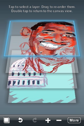
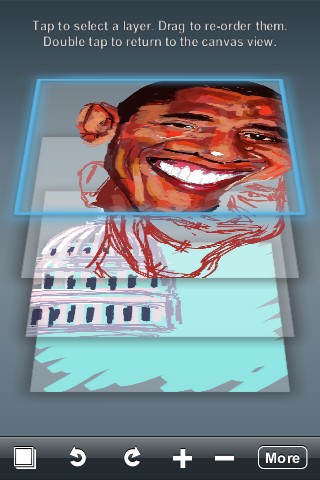
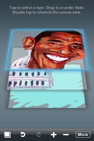
Rearranging layers is simple. Before even thinking about it, I found I’d intuitively drag a layer from one position to another and it would smoothly move, the other layers automatically shuffling around to accommodate it.
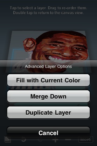
This makes merging layers a doddle too. Simply select one, press the ‘More’ button and choose ‘Merge Down’ and your layer is combined with the one below. Also to be found in the ‘More’ menu is the option to duplicate the layer and fill with the current colour. This works as expected but it’s worth mentioning a neat trick that may not be obvious. If your current ‘Colour’ happens to be the eraser and it’s set to, say, 50% opacity, then filling the selected layer with it will result in the layer becoming semi transparent. Duplicating the layer and merging the two would restore full opacity if needed. Not something you’ll need to do that often but worth knowing. The developer also mentioned he was thinking of adding the option of easily adjusting the layers opacity but this manual method works in the mean time.
Deleting a layer is a simple case of selecting it and pressing the ‘-’ button. Likewise, new ones are created by pressing ‘+’. Here’s my only real criticism of how layers are implemented: I found I assumed that when I added a layer, it would automatically be selected but no. Whatever layer was selected before remains so. This led to a number of occasions when I would finish painting on a layer, go to the layers screen, add a new one, move back to the painting view and start painting, not on the new one as intended but still on the old one. I’m happy to say the developer is considering changing this but for the time being I’m trying to get into the habit of returning to the paint screen by double tapping the layer I want to paint on. This selects the layer and returns to the Painting screen in one move – another nice touch.
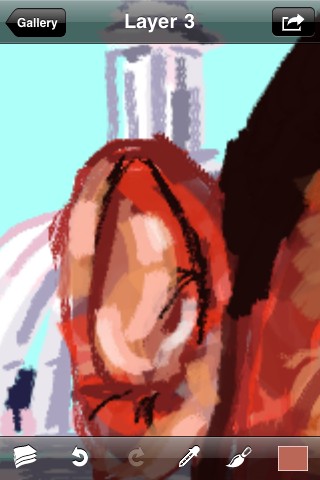
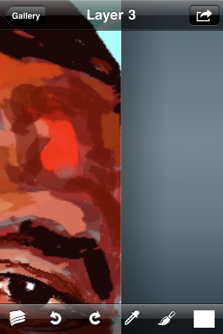
I did stumble upon an obscure bug that led to some layers not being saved but you shouldn’t let that put you off as the steps needed to reproduce it are pretty obscure and most users will not encounter it. I also informed the developer who’ll fix it.
To round off, moving, adding, deleting and filling of layers are fully undo and redo-able. All in all, the way layers are implemented is a joy to behold and a lesson to other developers in how to make a potentially complex and confusing feature almost transparently intuitive.
 New features
The developer also mentioned a new feature that he’s hoping to add in the future. It’s an interesting sounding community feature where users could upload, share and comment on each others work. Unfortunately it’s looking unlikely as Apple currently slap a ‘Mature 17+’ rating on apps with this type of ‘user generated content’ feature, presumably in case someone uploaded a picture of a nudey lady.
Let’s just hope Apple employ someone with a bit of common sense and revoke this ridiculous restriction. While you’re at it, take a moment to breath a sigh of relief that Apple aren’t in charge of our galleries and museums – presumably, they’d lock half of the old masters away in case someone feinted at the sight of a nipple. Let’s also hope it was the same joker who deemed a copy/paste function to be a frivolous luxury that no one uses in the real world. The thought of two people with such breathtaking stupidity working in a position of power at Apple doesn’t bear thinking about.
Verdict
In a sense, Layers is a one trick pony. If it wasn’t for the implementation of the layers feature, it would be a decent but fairly uninspired painting app. Although full of nice little touches and only a couple of minor annoyances, for me, it’s one major fault is the lack of a smudge tool. This is enough, though, to ensure PhotoForge currently remains my first choice for painting on the iPhone.
But I’m conscious that this is V1.0 and I can forgive its minor foibles and even a missing smudge tool. Why? Because of those layers… The layers feature is implemented quite brilliantly. It’s done so well that it’s almost impossible to imagine it being done any other way – the sign of great design and good reason to be very optimistic about future versions.
Are layers absolutely necessary for a Painting app? Clearly not as PhotoForge (and even Layers itself) can be used quite happily without them. But there’s no doubt that it’s a killer feature and will, I’m sure, be reason enough for many iPhone Artists to migrate. It’s a shame that there’s no Lite/free version of Layers (although the developer is considering it) as once you’ve tried using layers, it’s a tool many will be very reluctant to live without.
I have little doubt that, in time, Layers will mature into possibly the best Painting app available on the iPhone. It’s not there yet and, no doubt, the competition will already be working hard to keep up so even if you’re an iPhone Artist who doesn’t feel a need for the layers feature, you should be grateful to Layers for raising the bar.
Layers
Version reviewed: V1.0
Category: Entertainment
Developer: Benjamin Gotow
Current Price: £2.99
Works on: iPhone & iPod Touch
