 When it comes to the different genres of apps available on the App Store, the Project Management area is one of the least populated. A quick search of the store reveals only a handful of likely candidates and it’s clear it won’t be rivalling fart apps for sheer quantity anytime soon.
Far from the exclusive domain of accredited Project Managers, PM software can be used for anything from planning the Olympics to remodelling your kitchen or sorting out the family holiday. Good PM software can help organise the tasks, assign appropriate resources, identify bottlenecks and (in theory) predict when various milestones will be completed.
Defining exactly what qualifies as a Project Management tool is quite tricky. My broad, crude definition is software that includes Gantt charts. Try searching for ‘Gantt’ in the app store and you’ll not need to trouble your shoes and socks in order to count them all. Actually, at the time of writing, on the UK app store there’s a grand total of two apps that include a Gantt chart. The latest of these is ‘Projects’ from developer Thomas Blackburn.
 PM software can be a little daunting for a novice so it’s important that it’s well explained and easy to use. This is especially true when running on the iPhone with its reputation for ease of use. Projects falls a little short here.
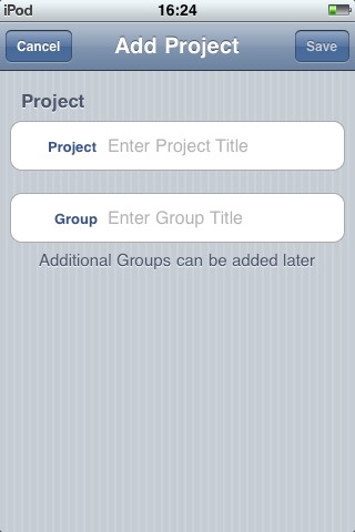
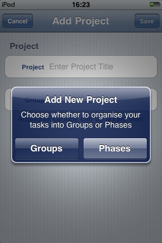
Almost immediately after starting Projects you’re confronted with the choice of ‘Groups’ or ‘Phases’. I’ve done a little Project Management work in the past and am familiar with several PM applications but this had me scratching my head. What difference the choice made wasn’t explained and so my decision had to be essentially random. As it turns out, the choice doesn’t make that much difference and can be changed later should you wish. Even so, it’s off putting to face this baffling choice right from the start especially for a novice. A little explanatory text here would help enormously.
Help?
It’s clear early on that a little help is needed both for the concepts of Project Management in general and the intricacies of Projects in particular. The user is left to his or her own devices when it comes to general PM concepts (get Googling) but the developer has created a helpful ‘Getting Started’ section on his website to give an overview of various elements of the app (although, oddly, the difference between Groups and Phases are not explained anywhere).
I deliberately avoided reading this until after I’d played with the app for a while to see how easy it was to use without external help. This resulted is confusion in a couple of places with some screens and features only being stumbled across by accident. Some would argue this indicates the developer should work on the design in a couple of areas to make things clearer to the user. I’d suggest he work on rather more urgent features first but add the stop gap of a link to his Getting Started web page on the opening screen of the app. Without this, many users simply won’t be aware that an external source of help exists.
As the developer provides a decent overview of the various screens and functions of the app on his website, I won’t duplicate the same information here. Instead I’ll report my experiences in using the app with a simple project.
Anyone for tea?
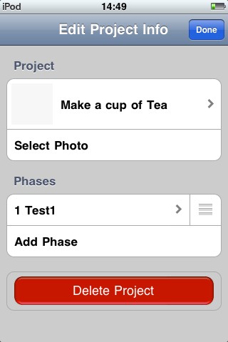
My standard test for PM software is to create a project listing the steps required to make a cup of tea. The immediate problem this hi-lighted was that Projects deals in units of a day or longer – there’s no option to have tasks of minutes or hours. I think this is a real problem as many tasks (some of them vital) can be only an hour or two long (perhaps less). I understand from the developer that he intends to rectify this in a future update but for now, it remains a problem. How big a problem depends on the nature of your project but this one omission could mean that the app is useless to you. It’s technically possible to work around it by pretending one day equals one hour and proceed on that basis but that’s a huge fudge and not something a user should reasonably expect to have to make in an app of this type.
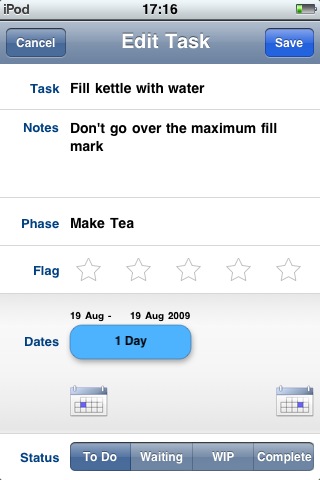
Adding a task is pretty straightforward but there’s a quirky little control that’s worth mentioning. As well as calendar buttons to mark start and end dates, you can drag the duration bar left to decrease the time and right to increase it. This works but feels a little fiddly and coarse. If you drag it above 1 week, it increases by multiples of weeks and then after 8 weeks it switches to months so a task with a duration of, say 10 days will have to be set manually. I found this control a little odd at first but decided that it was due to it being above the calendar buttons. This made it feel like the primary way to enter duration. By simply moving the bar below the calendar buttons, I think it would make their relative importance clear to the user and help end the awkward input of the start/end dates that I experienced.
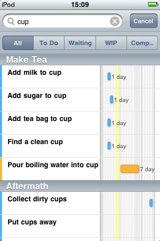 Gantt Chart
Projects largely revolves around the Gantt chart. For those unfamiliar with them, they’re a way to present tasks so their duration and order are clear. Being a very visual person, I love anything that portrays complex or detailed information in a simple, visual way and this is exactly what a Gantt chart does. The implementation of the Gantt in Projects is quirky but not unusable.
For example, in order to see future or past months you’ll want to scroll the view horizontally. Your natural inclination is to swipe left and right. In portrait mode, this brings up the option to delete the task you happened to swipe. In fact, to scroll, you have to swipe a narrow band at the very top of the chart.
This is a good example of a feature that I only learned about after reading the developer’s website. It’s also a good example of the odd design evident through the app. Is it really best to use swipe to delete tasks here or would it be better used to scroll the view and delete tasks on the task edit screen? The choice seems obvious to me but perhaps I’m in the minority.
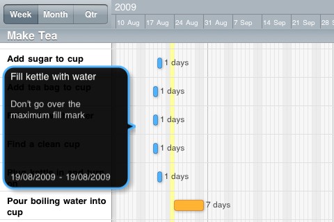
Unsurprisingly, given the format of Gantts, it also works in landscape mode but this is at the expense of functionality. The toolbars and search bar visible in portrait, disappear in this orientation but it’s generally a reasonable trade off. What feels less so is the fact that it’s not possible to zoom in or out of the Gantt. The only options available to you is a choice between displaying 3 weeks, 3 months or 5 months. You’re also able to choose the number of past weeks to display. I’d like the ability to choose the length of time to display from 1 day to a year (or more) and not be limited to pre-sets.
Ideally, I’d like to be able to use a pinch gesture to zoom in and out, showing not only the length of time I want but also more rows of tasks. On that subject, although it’s generally well laid out, I felt the vertical space was a bit wasted. If each row had less height, more tasks would happily fit on screen. The rows seem to be set to the current height to accommodate the notes but they don’t shrink down even if the display of notes is switched off or for tasks that have no notes so, all in all, it’s a bit of a waste of space.
Incidentally, swiping left or right on the main body of the view in landscape mode neither deletes a task or scrolls the view – another odd design decision.
No dependents
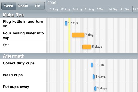
For me, the single biggest fault with Projects is that it doesn’t include dependencies. This is where you can say Task B doesn’t start until Task A has finished. So, if you need to amend the start date or duration of Task A, Task B automatically updates to accommodate the changes.
In Projects, tasks can only be set to start one after the other by ensuring the start date of one task coincides with the end date of another but that’s a lot of fiddly work and isn’t the point of software to make things easier? Having to explicitly state every single start and end date of each task is not only a pain when setting up your project but means that any changes or delays have to be manually input. It also discourages experimentation trying to find a more efficient project setup or to shorten the critical path. For me, this tips Projects over the line from useful to, well, not very useful. The good news is that the developer is already working on this and we should see dependencies in the not too distant future.
The omissions don’t end there though. Several other standard Project Management features are missing such as resource management, critical path and import/export of MS Project files. You’re also unable to mark what percentage of a task is complete and you’re limited to changing their status to either ToDo, Waiting, WIP (Work in Progress) or Complete.
 Verdict
Anyone expecting a fully featured portable version of MS Project will be disappointed with Projects as it’s lacking some important functionality. This is the developers first app and while it’s a good start, I can’t help but feel this is closer to V0.5 of the software rather than V1.0.
More than any other app I’ve tried, a project management application needs to have a minimum set of particular features to really be of use and currently, Projects is short of a few of them. At least some of those missing features are planned to appear in future versions so the question becomes, is it usable in its current state?
If you’re already familiar with PM software, I think it’s pretty impossible to use Projects without noticing and missing at least one or two favourite features. If, on the other hand, this is your first taste of a Project Management application and plan to use it for only fairly simple projects where tasks are at least one day long and unlikely to change start dates, you may find Projects delivers in a reasonably effective way.
So, a promising start but you may want to wait for version two.
Projects
Version reviewed: V1.0
Category: Productivity
Developer: Thomas Blackburn
Current Price: £3.99
Works on: iPhone & iPod Touch
