 It’s rare for an iPhone app to make a splash out in the ‘real’ world but Brushes has. Famous for being used to paint the cover to The New Yorker magazine and a favourite of no less an Artist than David Hockney, it’s one of those rare apps to cross, at least somewhat, into the main stream.
Having recently reached it’s first anniversary on the App Store and with strong competition appearing all the time, Brushes was starting to look in danger of falling behind. Now, though, version 2.0 has been released. Has it done enough to retain the iPhone Painting crown?
To bring you up to speed, I’ve previously looked at PhotoForge and Layers. While I was extremely impressed with the implementation of layers (the feature) in Layers (the app), my preference for painting remained PhotoForge. Despite a couple of workflow bottlenecks, the inclusion of a smudge tool makes up for them, allowing me to quickly and easily blend colours together. This cuts down the work and time required for a painting by an appreciable amount.
Anyone looking into the Painting app genre, can’t help but hear about Brushes. It does now carry a bit of baggage around from its growing fame but I wasn’t aware how much effect this had on me until I ran it for the first time.
 First impressions
Although this is a review of V2.0, I installed Brushes before the update came out so my first sight of it was V1.1. About three minutes after installation, I found myself checking the developer’s website and reading through the user’s guide (PDF link). Why? Because I couldn’t believe that was it. There were only a couple of screens and a handful of features. I was expecting much more.
This isn’t a fault of the app of course. It’s my own, based on the mental picture I’ve built up through reading about it and hearing the comments left by many of its fervent users. Also, assessing an app on its tool or screen count is a bad way to judge. After all, a pencil is one of the simplest tools in the world but a talented Artist can conjure up a masterpiece filled with breathtaking detail and subtlety with one. The tools an Artist uses are probably the least important factor in how good the end result will be. Still, the better they are, the easier it makes the process. Despite knowing all that, I found myself initially disappointed with what Brushes offered. I had to start again.
So, having made my preconceptions stand in the corner with its back to the room, I returned to Brushes with a fresh eye and a determination to look at it with an open mind.
 First impressions… again.
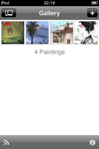
When you first start Brushes, you’re presented with the Gallery view where you’ll discover a few sample paintings. These show a nice range of styles and show what’s possible with the app although the developer may want to add one or two new ones that demonstrate the use of layers. From here you can load an existing photo (to act as a starting point for the painting), export your paintings using a built in web server (more on that later) or press the ‘+’ button to create a blank canvas.
Tapping a picture opens it up in viewing mode where you can see it full screen, move back and forth through the paintings in your gallery or press play to start a slideshow. There’s also an icon to delete the current picture and an option button allowing you to duplicate the painting or save a copy into the camera roll.
I’d be happy to bet that every new user of Brushes has done exactly what I did (several times) and tap away uselessly at the screen here, trying to paint. What you need to do is press the Edit button to actually get painting. I’d suggest making the difference between the view and edit modes visually more obvious, perhaps by displaying the toolbars in a different colour or adding a border around the pictures. I don’t see why you shouldn’t also be able to zoom in and out while in view mode but that’s not a big deal.
Painting Mode
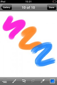
Pressing ‘+’ in the Gallery or ‘Edit’ while in viewing mode, gets you painting. Assuming you started a new one, here you’ll see a plain white canvas with a navigation bar along the top providing a Gallery button and a (rather pointless) ‘Done’ button that merely returns you back to viewing mode. The lower toolbar consists of icons for layers, brush/eraser, undo, redo, eyedropper (colour picker) and colour. I’ll take these functions one at a time in reverse order.
Colour screen
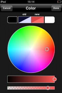
This is dominated by the colour wheel where you simply tap within it to make your selection. Above that are four swatches, the end two providing quick access to black and white. The middle two show your previous and new colours. These display the colours against black and white backgrounds to give an idea how the transparency affects it.
Below the wheel are sliders for brightness and opacity. When you’re happy with your colour choice, pressing ‘Done’ takes you back or ‘Cancel’ returns to the painting screen without changing the colour.
Colour picker
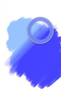
The other way to select colour is by using the ‘eyedropper’ tool (which I prefer to call the colour picker). As with other painting apps, this can be summoned into existence either by tapping the icon or pressing and holding on the painting. When I originally reviewed Layers, I was frustrated about how long you had to hold for the picker to appear (although that’s now been fixed in a recent update) but Brushes works just fine, not requiring too long a hold before it appears.
Undo/Redo
Undo and redo work as you’d expect. The documentation suggests the undo stack isn’t limitless but I didn’t ever find myself running out of undo steps while painting. It should be noted that unlike PhotoForge, the undo stack isn’t kept between sessions so once you’ve gone back into the Gallery screen or quit Brushes, you’ll no longer have the option to undo any strokes made in a previous session. This isn’t unreasonable but with a similar app allowing you to undo from a previous session, it would make a nice addition.
Brushes and Eraser
Next stop along the toolbar is the Brush icon which takes you into the Brushes screen. This has two modes, toggled by pressing either the Brush or Eraser buttons at the top, left of the window.
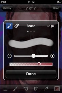

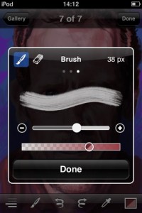
Brush mode allows you to select your brush type and adjust the stroke’s opacity. You can also change its size either by using the slider or fine tuning it with a tap on the ‘-’ or ‘+’ buttons at either end. The precise size of the brush is shown at the top in pixels. You can increase the size up to 64 pixels wide but the largest I tended to use was only around half of that – anything above that didn’t really allow me to work to the level of detail I wanted. Still, good to know the larger size is there if I need it.
How you change the brush type isn’t immediately obvious but the three dots above the example stroke provide the clue. As with the various pages of the home screen on the iPhone, changing from one to another merely requires a swipe left or right.
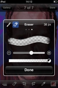 For a painting app, and especially one called ‘Brushes’, I was surprised to discover there were only three to choose from: smooth, fine bristly and rough bristly. This doesn’t particularly bother me as I tend to quickly settle on my favourite brush in an app and stick with it (rough bristly in this case). However, judging by the comments I’ve read on various forums, having a wide selection of brushes seems to be an important feature for a great many people. This has always puzzled me as it’s what you do with the strokes that has the greatest effect on the end result rather than the type of brush used. The character of the brush largely disappears after a few strokes. Even so, it does seem a bit mean having such a small selection to choose from.
Pressing the eraser icon changes the screen over to the second mode. Unlike the Layers app, the controls for the eraser are beautifully integrated into the same screen as those for the Brushes. Barely a thing changes between the two modes as the controls for one serves the other. Although the example stroke remains much the same, it now displays the strength of the eraser by showing the familiar Photoshop style chequer pattern (indicating transparency). The more powerful the eraser, the more transparent the stroke becomes – brilliantly intuitive.
When you leave this screen while in Eraser mode, the toolbar icon changes to match this showing which mode you are in. It switches back when you return to brush mode.
Layers
This is the second Painting app I’ve looked at with this feature. The first one was ‘Layers’ where I was so impressed by the implementation that I couldn’t imagine it being done any other way. Brushes does it another way. Having a good idea of how long software development takes, I have no doubt that layers have been worked on for Brushes for quite some time and its appearance now is certainly not a direct result of the arrival of the Layers app as many might think. This gives us an interesting opportunity to see how two separate developers tackle the same problem and come up with different designs.
At the top of the screen, the toolbar allows you to import a photo as a new layer and provides a ‘Done’ button to return you to the painting screen (a double tap on a layer does the same). The lower toolbar gives the options to fill a layer with a colour, merge the active layer down with the one below, undo, redo, delete current layer and create a new one.
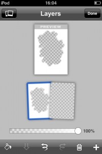
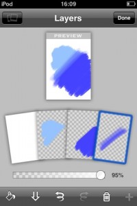
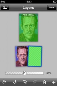
Where the Layers app presented layers in a 3D display with an animated transition from the painting screen, Brushes cuts abruptly from the painting screen to layers and uses a ‘hand of cards’ metaphor to display and manipulate the layers. This does result in them being shown relatively small on screen but leaves room to include a preview of how all the layers look together.
Manipulating the layers is easy. Moving is a case of dragging from one position to another and deleting is achieved by simply selecting a layer and tapping the ‘trash’ icon. Adding a new layer and merging two is pretty self explanatory from the icons.
Brushes has a couple of features that Layers currently lacks. First, is the ability to easily adjust the opacity of each layer via a slider. Second, touch and hold on a layer and the now familiar ‘Copy’ option pops up. Move to another painting and (assuming you don’t already have the maximum number of layers), touch and hold again and the Copy & Paste options appear, allowing you to paste layers from one painting to another. Not something I had a use for during my time with the app but a handy feature to have nonetheless.
You can have a maximum of four layers which is one less than you get in ‘Layers’ but, as with that app, I don’t think the limited number is much of a restriction. If the Beatles can record Sgt. Pepper using a four track, you shouldn’t have too much trouble creating your sketch with four layers. This is particularly true with Brushes as it allows you to copy and paste layers between paintings so you could theoretically have any number of them on the go and then merge them down to a final four in the finished picture. In practice I can’t imagine doing this myself but it’s another nice option to have in reserve should you need it.
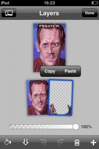
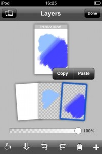
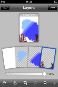
When you use the fill tool, a version of the colour selection screen appears, allowing you to choose a fill colour that’s different from your current painting colour. This screen puzzled me a bit as it includes an opacity slider. This seems redundant as you’re already able to set and change a layer’s transparency in the layers screen. So, it’s possible to select a fill colour with an opacity of, say, 50%, come back into the layers screen and, even though the layer is set to 100% opacity, it shows as 50% transparent. As far as I can tell, this duplication of opacity sliders doesn’t allow you to do anything more than if you simply had the layer opacity slider, hence my puzzlement.
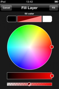 Starting a new painting creates one with two layers by default. The lowest layer is filled with white and you paint on the next layer up. It’s possible to erase the colour on the bottom layer (i.e. the ‘paper’) which will display the familiar chequer pattern indicating transparency.
When you’re back in the painting screen, the layers icon reflects how many layers exist (with white lines) and which is currently selected (with a longer line). This is a lovely bit of design, giving you all the information needed in an efficient way without hogging screen space.
Which implementation of layers people will prefer between Layers and Brushes is difficult for me to predict. They both have their plus and minus points – the layers are displayed larger in Layers, Brushes shows a preview, Layers animates the transition from the painting screen, Brushes allows you to adjust the opacity of each layer, Layers gives the option to rotate layers and Brushes allows you to copy and paste layers between paintings. They could both slug it out, feature for feature to a standstill.
Overall though, I prefer the larger, animated, 3D style used in Layers but there’s not a lot in it and Brushes succeeds in also offering a different but perfectly usable implementation of layers. The bottom line is you don’t really need to base your buying decision on the layers feature as they both work fine.
Painting
Enough exploration – on with the painting.
As mentioned before, I was initially surprised at the apparent lack of features in Brushes but the proof of the pudding is in the painting (or something like that) so, I jumped right in. At first it seemed pretty standard stuff. Pick a colour, size the brush, zoom into the area I want and start painting.
There was the inevitable process of finding the best way to do stuff given the tools available but once I got over that hump, I started to notice little things. Or, rather, I’d slowly realise that, here and there, something worked a bit better and more naturally than I was used to. It’s actually quite difficult to pin down the various things that just feel right but here’s an example.
Brushes doesn’t come with a blend/smudge tool which I’ve found to be a great aid and speeds up the process of painting. But, while using Brushes, I found I developed my own way to blend between two colours that seemed quicker to me than the one described in the user’s guide as it only required one colour to be picked rather than several. Let me explain.
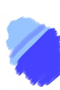

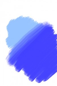
Imagine you have a splodge of dark blue next to a patch of light blue and want to blend between them. First, use the colour picker to change to the darker shade then make the opacity fairly low (25% or so). Now make a stroke on the lighter patch near (and parallel with) the border of the colours where you want the blend to begin. Move slightly closer to the darker patch and make another parallel stroke so it overlaps the first stroke a little. Then, move slightly closer to the darker patch again and make a third stroke so it overlaps the second and so on until you’re well into the dark patch. If you’ve done it right, the transition should be smoothed out.
There’s nothing clever about this technique at all but in other apps my teeth would be on edge doing this. In Brushes, it’s not nearly as much pain to do as I would have thought as I’d subconsciously been expecting the toolbar to interfere but with the clever coding, it largely stayed out of the way, allowing me to work the way I want to.
In Brushes, a single tap hides the toolbars and another one bring them back. But, while painting, when you slap down several ‘dabs’ or strokes in quick succession (as you might, for example, when blending between two colours), the app (usually) doesn’t get confused and have the toolbar repeatedly popping in and out. I don’t know if this is clever coding, luck or black magic. All I care about is that the app behaves as I’d like it to.
Don’t get me wrong, a dedicated blend/smudge tool would make this technique redundant (and good riddance to it) but given that I have to work this way, it’s made as painless as possible. This is just as well as the developer says that although a blend/smudge tool is a common request, it’s not something he has immediate plans for.


Another little touch that makes quite a difference is the fact that the opacity level doesn’t change when a new colour is picked. In the version of Layers I reviewed, whenever you used the colour picker to select a new colour, the opacity level was reset back to 100%. In Brushes, the opacity doesn’t change until you want it to. I should point out that a recent update of Layers has fixed this behaviour and it no longer resets the opacity automatically.
There’s something about the ‘feel’ of painting with Brushes that adds to the experience. For example, there were times when I’d swear the app recognised the pressure of my stroke! Yes, I know that’s impossible so you can probably imagine my surprise when I’d make a stroke, lifting my finger off at the end and the stroke appeared to get correspondingly weaker at the same point. After scratching my head for some time the only two explanations I could think of were 1) I was imagining it or 2) Brushes took the contact patch of the finger into account and altered the size of the brush accordingly, giving it a pseudo pressure sensitive effect.
I had to check on this with the developer, Steve Sprang. This was his reply: “The OS may have information about the size of the contact area, but that information is not accessible to 3rd party apps. Perhaps you’re just seeing subtle differences in paint opacity at the ends of the stroke?”
Which obviously suggests it was my imagination – shame. However, it does lead to two conclusions. First, the fact that I had this feeling while using Brushes is an indication of the excellent ‘feel’ it imbues – not a very scientific thing to say but that’s the effect it had on me. Secondly, it prompts me to wish Apple allowed access to the contact patch information in the SDK (or, at least, make use of it themselves), giving the iPhone pseudo pressure sensitivity for free! Painting apps could adjust the strength of the stroke according to the pressure applied, piano apps could allow soft and loud notes to be played depending on how ‘hard’ you press the key… Come on Apple, how about it?
Zoomin’ and a Pannin’
A pinch allows you to zoom out to 70% and in to a generous 1600% which really puts your nose right up against the pixels and seems, if anything, a little too much – which is good as it’s unlikely you’ll feel the need to zoom in further.
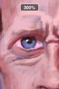
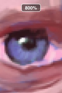
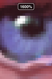
You’re also able to double tap on an area to immediately zoom between 100% and your last zoom level. If you find yourself accidentally double tapping and zooming when you didn’t mean to, you can turn this off in the Settings app if you prefer. Although I didn’t use this feature much I didn’t find it was triggered accidentally so I was happy to keep the option switched on, just in case. Another nice touch is the ability to pull the picture away from the edge of the screen when you’re zoomed in making it easier to paint up to the edges. When you zoom in or out to anywhere near 100%, Brushes ‘snaps’ to it making that much easier to return to normal view although the double tap feature makes that less of a necessity.
Panning is accomplished with a two finger drag but it’s tweaked to work while you zoom. It’s difficult to describe but they work together very fluidly making it a feel a completely natural action to zoom and pan simultaneously. Another example of something that simply feels ‘right’.
Brush size bottleneck
For all its good points, inevitably, there are some additional features that I felt were required. Apart from the missing blend/smudge tool, I wish there was a way to alter the size of the brush on the fly without having to go back into the brush screen to do it. I found this quickly became the main bottleneck, slowing me down from painting. Not by a huge amount of course but you tend to notice the small stone in your shoe when you’re running.
I always try to propose fixes to problems I find in apps and here I’d suggest using a three finger gesture to resize the brush without needing to activate the brush screen. Moving the fingers apart would increase the size and, obviously, bringing them together reduces it. Alternately, perhaps a two finger gesture turning clockwise to increase brush size and anticlockwise to decrease it would do the job – either way, options are there for a solution to this.

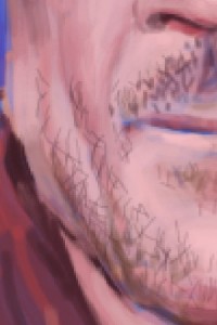

I’d also like a permanent indication on screen of the current size of the brush. It’s easy to forget what size you have selected after being distracted with picking a new colour, messing with layers or whatever. My suggestion (as it was with the Layers app) would be to include a circle in the brush (and eraser) icon – a large circle would represent a big brush and, obviously, a smaller one indicates a small brush with various sizes in between.
I also wish that when I turn my device upside down, the toolbars switch round but the image remains the same way up. I often draw upside down as a good way to get a fresh perspective on a picture. This is particularly handy if you’re drawing from a photo which you can also turn upside down. As it stands, you have to work the controls the wrong way up which makes it tricky to say the least. Working in landscape orientation would also be made much easier by the toolbars adapting to it. Why developers don’t routinely incorporate this feature is beyond me as it’s my understanding that it’s relatively easy to code (easy for me to say, I know).
As with all Painting apps (although I may have neglected to mention it before), I’d also love to have dodge and burn tools, maybe as two extra modes on the brush screen. These would allow users to easily lighten and darken colours meaning less need to fiddle around trying to find a colour’s neighbouring hi-light and shadow tones.
 Exporting
When you’ve finished your painting, there are a couple of ways to get your work off the iPhone and onto a computer. Arguably the easiest is to email it to yourself. To do this you have to first save it to the camera roll by selecting the ‘Add to Photos’ option from the viewing mode toolbar (which first gives you the option to rotate your painting). You’d then exit Brushes and run the Photos app where you have a choice of two ways to email it. First you could select and copy your picture, go to the Mail app and paste it into an email. This gives you a 320×480 JPG. The other option is to email directly from Photos which results in a 533×800 JPG. Although you get a higher res output using the second method, it does appear to be a rescaled version of the 320×480 image i.e. there’s no extra detail, just a stretched version of the smaller one.
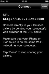
Your better bet is to use Brushes inbuilt web server to copy the paintings directly to your Computer. This is easily done by tapping the ‘Connect’ icon in the Gallery screen and following the instructions. It’s simply a case of firing up the browser on your computer and typing in the address displayed on the Brushes screen. Assuming they are on the same wireless network, the paintings in Brushes Gallery appear in your browser and you can then right click and save the files in either PNG or ‘brushes’ format. The PNG file comes across as 320×480. Not only does it mean getting your painting out in a lossless format but PNG will also retain any transparency in the picture.
By far the best method to get hold of your work in high resolution is to open the ‘brushes’ file using the free viewer available to download. To quote the description on the website, the viewer “allows you to replay your Brushes paintings stroke for stroke, export them at very high resolutions (up to 1920 x 2880), and even export them as QuickTime movies.” Unfortunately, the viewer is only available for the Mac and, therefore, I’m unable to test it. The good news is the developer tells me a solution is in the works for Windows users and should appear in a few months.
 Help
Help
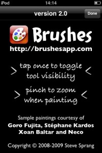
Anyone familiar with other painting apps will have little trouble getting to grips with Brushes. However, like almost all other apps, it does have it’s little foibles and semi-hidden features that many will not be aware of without prompting. The only help available within the app is to be found in the information screen accessed via the Gallery view. Here the help consists of “tap once to toggle tool visibility” and “pinch to zoom when painting”. Not exactly comprehensive.
To his credit, the developer provides a good user’s guide available as a PDF on his web site. I would suggest that although there’s a (non active) link to the website within the information screen, it is a little hidden away (especially to new or inexperienced users) so mentioning the website and user guide on the title or Gallery screens may reach a wider audience.
Natural Media?
Like Layers, Brushes is advertised as a ‘Natural Media’ application. This continues to bug me as it (along with Layers) is certainly not a natural media app as I understand the term from using the real McCoy in the shape of the fantastic Corel Painter. The developer, not surprisingly, disagrees saying “Brushes tries, to a reasonable extent, to make marks that look like something a real brush might make.” which, on the face of it, sounds fair but I personally don’t feel that a superficial resemblance to oil or acrylic brushstrokes is the same thing as realistically simulating the behaviour of paint on different surfaces as Painter does and indicates by using the term ‘Natural Media’.
But if my arguments aren’t enough to sway the developers of Brushes and Layers then perhaps the fact that the term ‘Natural Media’ is a registered trademark (of Corel, I assume) might. As with Layers, I think there’s enough good things about Brushes to boast about without misleading claims. I hope the developer changes this before Corel’s lawyers come a calling.
Just as an aside, I wonder if Corel are considering making a version of ‘Painter’ for the iPhone? Imagine that with the pseudo pressure sensitivity idea. Hhmmm, iPhone Painter… [sound of Homer Simpson drooling as he contemplates doughnuts]
 Verdict
Brushes recently reached its first year anniversary on the App Store and I think it’s fair to say it felt like it had been out for a while – both in a good and bad way. On the one hand all the little, under the hood settings had time to be tweaked to perfection while on the other, it had a fairly sparse set of features, giving it the feel of slightly aging software when compared with the recent competition.
The V2.0 update added a very decent and usable implementation of layers which is a great new feature. Only the fact that, for my money, ‘Layers’ does it a little better stops me from raving about it. The other additions (eraser and increased zoom level) are welcome but hardly ground breaking.
But there’s something about Brushes that means the whole is greater than the sum of its rather ordinary seeming parts. It’s just tiny little things here and there that feel right, like how the toolbars keep out of your way when you don’t want them and easily appear when you do and the gap between taps before it’s counted as a double tap and so on. All these things are basically numbers chosen by the developer. So easy to get wrong and so pleasing when they are right.
To make me a complete convert, I’d like the addition of a blend/smudge tool and a way to alter brush size without interrupting my workflow. Not every Artist will want the same features though and a great many will (and do) find Brushes provides all they need already with the addition of layers only serving to please them even more.
To be honest, I think Brushes fame probably has more to do with the length of time it’s been around than its inherent quality. As good as it is, judged objectively against the likes of PhotoForge and Layers, it’s not exceptional. But it’s been around for a year whereas those others are recent additions to the App Store, building on Brushes success and features. So, I’m not surprised it was used to paint the cover of The New Yorker (although I’m not a fan of the picture used) but the fact is, there are at least two or three other painting apps that could have been used to produce a picture of at least equal quality.
But it’s the indefinable ‘feel’ that is Brushes key strength. It’s nothing major or something you could really list as a feature but it seems a little easier and more natural to paint with it.
After reviewing Layers, PhotoForge remained my favoured painting app mainly because of its smudge tool. Has Brushes replaced it? That’s not so straightforward to answer. I feel the need to stick with it for now, if only to see if it reveals any more nice touches and if a blend/smudge tool comes along in the near future, I can see Brushes becoming my favourite. However, with the competition bringing out updates all the time and new apps hitting the Store regularly, Brushes will have its work cut out to continue to hold its own against its rivals.
It arguably remains leader of the pack for now, but only just.
Here’s a video of an earlier version of Brushes in action:
Brushes
Version reviewed: V2.0
Category: Entertainment
Developer: Steve Sprang
Current Price: £2.99
Works on: iPhone & iPod Touch
