 I began a quest of sorts a few months back when I reviewed PhotoForge. This was the first serious painting app I’d used for the iPhone and while being very impressed, it whet my appetite to see how the other major Painting apps compared.
So, next came Layers with its unique (at the time) implementation of layers. The main thing that bugged me was the lack of a blend/smudge tool (which PhotoForge had included). Most recently, I looked at the original serious painting app, Brushes. It now included its own version of layers and had a very nice, if difficult to describe, ‘feel’. But, annoyingly, it also lacked a blend tool.
So, imagine my interest when I came across ‘Inspire’ whose key feature was, according to the developer, KiwiPixel’s description on the App Store, that it “simulates wet paint on a canvas, allowing amazing blending effects.” This I had to try.
 First, I should probably explain why a simple blend tool has taken on such importance. It’s entirely based on my experience with the painting apps. PhotoForge happened to have what it calls (accurately as it turns out) a ‘Smudge’ tool. While this is crude compared to Inspire’s more sophisticated blending, it was good enough to help smooth the transition between two colours or tones. However, when I used Layers and Brushes I realised how much extra work it was without a tool of this sort. With all the needless extra taps and brush strokes required, it meant a typical painting would take appreciably longer to complete.
Who’d have thought it would be so significant? Not me but the fact was that, without one, smoothing the join between two colours forced me to work the way the software wanted rather than it working the way I wanted – a pet hate of mine. Inspire promises to not only end this frustration but potentially go much further. First, though, I had to familiarise myself with it’s various screens and options.
Main Menu
After firing up the app, you get a short intro sequence showing the Inspire and KiwiPixel logos. As quick as it is, it would be nice to click through it but, unfortunately, this isn’t possible as the app uses the time to pre-load large amounts of data and crunch some big numbers in order for it to perform as well as it does on the limited iPhone hardware. Following that, up pops the Main Menu. Here you have entries for Gallery, Options, Info and Tips & Tricks.
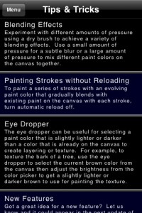
Tips & Tricks
This section lists ten areas of help covering such items as how to flick through the settings, duplicating paintings and where to submit feature ideas. This is a very useful section and one I wish more developers would include within their app. In fairness, not all apps need much help but in one such as this with a quirky interface and unfamiliar options, the help is necessary and welcome.
Info
This screen simply shows the version number as well as a link to the developer’s website. It also encourages you to email your best paintings off to the developer so they can be included in their online gallery. The email address is shown but isn’t ‘live’. However, that’s not a problem as the process is automated elsewhere in the app.

Options
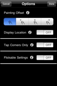
Here you get a handful of general options including one to select an offset allowing you to paint in an area just above and to the left or right of your finger. Although I’ve been curious to use an offset before, after trying this, I tended not to use it. I found it just felt more natural to paint where my finger touched the screen. Good to have the option available though.
The next few options allow you to display location with an onscreen cursor, bring up the Painting Menu by tapping the corners of the screen and have ‘flickable settings’. This last one allows you to swipe left and right while in the painting options screens rather than have to back out to the menu and go back in via the Painting Menu – you’ll want to set this to ‘On’, trust me.
Also on this screen, you’ll come across another type of help that’s scattered throughout the options screens. This is in the form of ‘i’ (for information) buttons which, when pressed, provide specific help on the control they’re associated with. I found this invaluable and, again, I’d recommend other developers follow suit.
 Gallery & Browsing
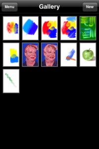
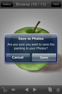
This is where all your work’s stored. From here you can get back to the main menu, create a new canvas or tap on an existing painting to ‘Browse’ it. In the Browse view, as well as buttons along the top to take you back to the Gallery and start Painting, there’s a toolbar along the bottom. This includes icons to save the image to photos, email the painting, move back and forward to view your other work, duplicate painting and, finally, delete the current image.
They’re not big problems by any means but it seems slightly odd that you can’t simply swipe left and right to move to the next painting along. Also, as I found with Brushes, I can’t see a reason not to be able to zoom into a painting in Browse mode but Inspire also doesn’t offer this.
Painting mode
Hitting the ‘Paint’ button moves you from Browse to Painting mode. When I looked at Brushes, I mentioned that there was little visual difference between its view and painting modes leading to useless strokes being placed in viewing mode. Here the difference is more obvious as browse has conventional toolbars, whereas they fade away when you move into painting mode.
Painting Menu
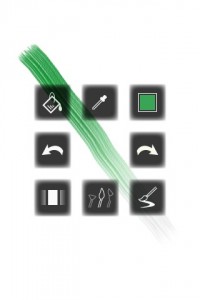
Where other painting apps have toolbars along the top and bottom of the screen, KiwiPixel has come up with something a little different for Inspire. When you’re in Painting mode, tapping on the centre of the screen brings up the Painting Menu. This is a cluster of tools arranged in a square shape. Starting from the top left and working clockwise, you get Fill, Colour Picker, Colour Selection, Redo, Brush Usage, Brush Selection, Return to Browse Mode and Undo.
Tapping on any of these tools either performs the action or takes you to its screen, depending on the icon. One of the application’s Hints and Tips suggests a way to speed up use of the Painting Menu. When it’s activated the icons appear in the centre of the screen and spread outward, forming the ‘box’. However, once you start to become familiar with the locations of the tools, it’s possible to tap on where they’ll be before they get there. The developer calls this a “quick painting menu selection”. For example to quickly undo a stroke, you’d tap the centre of the screen then immediately tap a centimetre or so to the left to press undo and finally tap back in the centre to dismiss the Painting Menu. With practice, this should become one quick, fluid movement.
 I must say that during the several days I was using the app, I didn’t get up to speed enough to be able to take advantage of this quick selection method. I was stuck in the slow lane, peering at the screen to find the icon then prodding away carefully. I’m sure this quick method will work for many (maybe even me, if I keep at it) but if my experience is anything to judge by, not everyone will find it easy and quick to use, at least in the short term.
As it’s called up with a single tap on the screen, it’s possible that the occasional painting stroke will activate the menu when it isn’t wanted. If you find that happening too often for your liking, there’s the option (in the Main Menu options screen) to only activate it with a tap in the corners of the screen rather than the centre. The idea is that you’ll rarely be painting in a corner so are unlikely to bring it up by accident. The downside is that the ‘quick painting menu selection’ then becomes impossible.
Once I got into my stride with the painting, I did find that the painting menu would appear when it wasn’t wanted. This seemed to happen a lot so I tried setting it to only appear with a tap in the corner. This certainly stops the menu appearing unnecessarily but I found it frustrating as it became awkward to tap in the corner then move my finger to the middle of the screen to tap the tool I wanted then the centre of the screen to dismiss it. So, in the end I turned the option off and settled for living with the painting menu popping up when it wasn’t wanted. I hope the developer either tweaks the workings of the painting menu or offers a more conventional arrangement in the future.
At the moment the Painting Menu only really works in Portrait mode. It appears in Landscape but unrotated thus making it cumbersome (and impossible to use the quick painting menu selection). This is planned to be fixed in a future update. I hope the developer also allows for upside down use (both for Portrait and landscape modes) as I for one, like to use this orientation regularly to get a fresh perspective on the painting.
Well, that’s the Painting Menu, but what of the actual tools?
 Fill
Fill
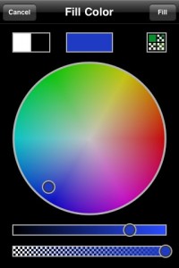
Inspire keeps track of the fill colour so when you open the screen, the last fill colour is already chosen. Selecting another is done as you’d expect: tap somewhere within the wheel and adjust the brightness and opacity sliders. In the top right of the colour window is a grid icon. Pressing this takes you into the Grid Palette which can be found both here and in the Colour Selection screen.
Unlike all the other painting apps I’ve tried, Inspire keeps swatches of colours so you can easily reuse them but I have to admit to finding this initially baffling. I’d assumed it was a case of my manually adding the colours I wanted to the palette but try as I might, no end of double tapping, swiping, sliding or magical incantation would add the colours.
The developer was able to set me straight. It actually works in a much simpler way. When you pick a new colour and press ‘Done’, it’s added to the palette of 80 swatches. If it’s the same as an existing colour, it’s not added. Simple. The developer went on to explain the positioning of the colours.
“They are sorted in order starting from the most recently selected colours. So if you go into the colour picker, select a green colour, for example, then press Done, next time you go into the colour picker you should see the green colour at the beginning of the previously used colours grid in the top-left square. If a colour that is already in the grid is selected, it gets removed from its current spot and moved to the top – you should never see duplicate colours in the grid.”
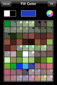 I was curious to know if there was a different set of 80 colours for each painting but quickly discovered the same palette grid applies to all paintings. I’m in two minds as to whether I’d prefer a different palette for each painting or not. I’m currently erring on the side of not as I didn’t really make use of it during my painting. I found I changed colour so often (tweaking its opacity counts as a different colour), that colours tended to slide off the end of the palette grid very quickly. I’d prefer the option to reserve, say, the bottom third of the grid for my own choice of colours. I’d find it very useful to be able to drag a colour from the changeable palette into my permanent one. The developer is considering this suggestion for a possible update in the future.
Colour Picker
This acts much as you’d expect from other painting apps with the exception of how you bring it up. It’s one of the tools in the Painting Menu and can only be enabled from there. I have to admit I really missed the ability to bring it up with a simple tap and hold gesture as most other painting apps now feature. So much so, that if I had one wish to change the app, it would be to add this ability. In a single stroke a healthy chunk of the frustration I had using the Painting Menu would disappear. I don’t think it would interfere with the current tools at all and would just add that functionality for those of us who prefer it – come KiwiPixel, pretty please?
Colour Selection
This is identical to the fill colour screen with the exception that you are shown the ‘old’ and ‘new’ colours whereas in the fill colour screen, it just displays the current colour.
When I first saw the colour screen, there was something about it that bothered me a little. Something that made it seem a bit old fashioned somehow. It soon struck me what it was. Transparency is indicated by a chequer pattern. But, unlike other Painting apps that use the Photoshop style chequer, the pattern chosen for Inspire reminds me of the type used by drawing applications of old such as Deluxe Paint and Animator Pro.
These worked back when your palette of colours was a heady 256 (and sometimes less). So, the result was that there’s a slight visual incongruity between a colour wheel that clearly shows thousands of colours and what looks like a limited palette of 256. This isn’t a big problem of course (it’s not even a small problem) but I have to admit it did continually nag at me throughout my time with Inspire. Admittedly it’s probably only me that will be bothered at all by this.
 Brush Usage
Having an app that allows you to play with realistic blending, requires more sophisticated options than normal so it’s no surprise that Inspire includes some specialist controls.
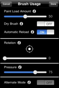
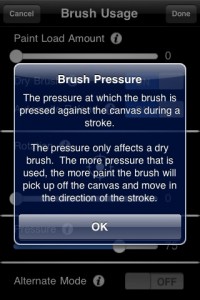
The Brush Usage screen is where you’ll find such controls as ‘Paint Load Amount’, ‘Pressure’ and ‘Automatic Reload’. Not the sort of thing most users will be familiar with. It’s here that the little help screens come into their own, explaining the functions of all the weird and wonderful buttons and sliders.
So, for example, you learn that ‘Paint Load Amount’ alters the length of a stroke before it runs out of paint. Reduce this slider and your stroke will be shorter. Lengthen it and it’ll go on that much longer. I tended to keep this at the maximum length and, indeed, wished there was an option for an infinite amount of paint but the developer isn’t keen on this as it goes against the principle that Inspire simulates real paint which is difficult to argue with.
The opposite of this is having a paint load of zero – a ‘Dry Brush’ in other words. What use is a brush with no paint? Plenty. In real life, if you move a dry brush through an existing stroke what would you expect to happen? The Brush would drag some of the paint it runs through with it, spreading it out as it goes. And this is exactly what happens in Inspire. I’ll come back to this when I talk about what it’s like to paint with.
If you have the Palette Knife selected as your brush, there’s the option to set ‘Alternate Mode’ on. This allows you to scratch away at your painting as you could do in real life. Why would you want to? Mostly to get pure white hi-lights. This is as close as you’ll get to an eraser in Inspire and it might be useful to be able to alter the size but it’s a nice addition as it stands.
 Brush Selection
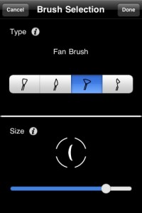
If you set the Main Menu ‘Flickable Settings’ option to ‘On’, you can swipe back and forth from the Brush Usage Screen. To its right is Colour Selection and to the left is the Brush Selection screen. Unlike the previous screen the controls on this one will seem reassuringly familiar. The first one selects between four brushes: Flat, Round, Fan and Palette Knife. The second is a slider to adjust the brush size.
I couldn’t help feeling both the Brush Usage and Brush Selection screens would benefit greatly from a redesign. For example, if you’ve chosen a round brush, there’s no need for a rotation control. Also, the alternate mode option only applies when the palette knife is selected.
When you have, say, the chisel brush selected and set a rotation of 45 degrees, the indicator changes to reflect this. However, the almost identical looking size indicator on the Brush Select screen remains upright. This seems odd and it strikes me that combining the rotation and size controls would not only avoid the confusion but also save space too.
From a graphical design point of view the Brush Usage screen suffers from a bit of odd alignment of some of the elements. You may think this is being picky but a slick graphic design (or even just a tidy up) would add to the clarity and usability of the software.
Actually, I’ve got a feeling that with some thought and a re-design, both these screens could probably be combined into one.
Zooming and Panning
In a satisfyingly familiar way, you can zoom in and out by using a pinch. Panning is a somewhat less predictable affair as it has to be done as part of a zoom. To quote the help text on panning, “touch two fingers on the screen then use one of them to move around.” Brushes uses a very similar idea but pulls it off perfectly. The version you encounter in Inspire, feels more like the clunky prototype.
 It starts to become particularly irksome if you want to pan more than one screens worth as you have to repeat the two finger zoom and pan again. Otherwise, you’ll do a pan then, without thinking, try to pan further with another one finger drag which results in an unwanted brush stroke. In the end though, I found the simplest thing was to pan using a two finger gesture. I hope this gets cleaned up in the future as it has a way to go before it becomes the seamless experience it should be.
Painting
As ever, the heart of a Painting app is, naturally, the Painting. An app could have the slickest interface in the world but if the painting’s crap, what’s the point? Likewise, its interface might be full of awkward design and poorly implemented controls but paint like a dream. Which side does Inspire come down on?
I found it took me some time to really get my head around the Painting in Inspire. Not because it’s hard to do but more because it’s such a different experience to the other Painting apps I’ve used until now. Where they replicated the experience of applying colour to a surface in a very rudimentary way, Inspire simulates paint more realistically than I might have imagined possible on the iPhone. A few simple examples soon made me realise this was something different.
Make a brushstroke and it gradually peters out of paint, thinning as it goes. Wow.
Turn on the dry brush option, zig zag it through your first stroke and watch the paint being spread backwards and forwards. Double wow.
Choose the palette knife, turn on alternate mode and scratch away some paint, leaving the gleaming white canvas shining through. Triple wow with sugar on top.
Let’s get this out of the way now – I luurrve painting with this thing.
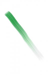
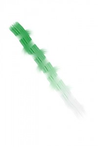
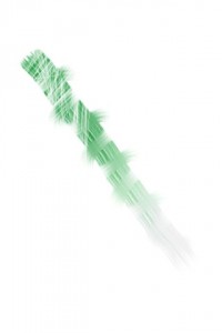
It really feels like you can ‘work’ the paint in Inspire. In other apps, you plop the paint on and it’s instantly ‘set’. Any other marks you make on top of it have no effect but in Inspire making a stroke involves not just the current colour but any and all colours that it comes in contact with. In this way, the painting feels organic and workable, allowing the Artist to approach it much more like a real painting.
Mix yellow with red and you get orange, just as you would in the real world. Attempt the same thing in the only other Painting app I’ve tried with something similar (the smudge tool in PhotoForge) and you get a dirty smudge. There are limits to the colour mixing abilities of Inspire but these are down to the RGB colour model used and applies to similar desktop apps. Even so, after using other iPhone Painting apps, the blending and colour mixing possible in Inspire are a revelation.
So, after the initial fireworks of mixing colours and pushing paint around, what’s it like to create a real picture using it? Interesting, surprising, experimental and fun.
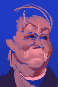
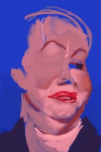
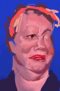
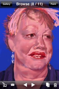
I opted to paint a picture of UK comedian Jo Brand as she has an interesting face that I thought would particularly suit blending. I was right but found the work went through several stages starting off pretty badly. This was a combination of a couple of things, not least the fact that I began with the intention of producing a caricature but changed my mind halfway through and aimed for a more ‘straight’ portrait. The change in the proportions were tricky to fix and I found myself wishing Inspire would allow me to scale the picture’s height, which, of course it doesn’t. I also thought it would have helped me fix things if layers had been available but they’re not and I can live without them.
The other main problem I had with the portrait was down to me learning Inspire as I went. What was possible and how to use the tools takes a little time to learn and I think less experienced users are likely to find things somewhat confusing. But time spent experimenting is rewarded with some great effects and surprising techniques.
For example, it dawned on me there’d be a value in underpainting with Inspire. If you’re unfamiliar with the term, underpainting is a technique used (especially in Oils) where an underlying colour is applied and thinner washes of a different colour are laid on over the top. The result is a combination of the second colour with the underpainting partially showing through. This is often used in portraiture where the underlying tissue affects the appearance where the skin is thin – around the eyes, for example.
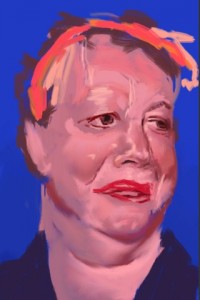
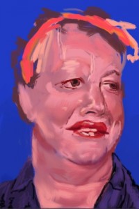

Although I guess I could apply colour in thin (i.e. fairly transparent) strokes to try and replicate the traditional use of underpainting, I discovered a different technique worked better here. I found the fully opaque flesh tone brush strokes mixed in a little with the underlying canvas colour (blue in this case) creating a nice effect. I was learning as I went on the portrait so didn’t have the chance to fully explore the technique but this unexpected finding shows how flexible Inspire’s painting simulation might be.
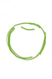
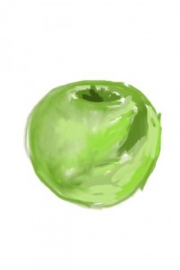
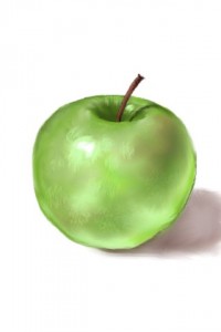
This blending also results in paintings with a unique look compared to other painting apps. There’s a temptation to overdo it and smooth everything out until it looks artificial (and I think I may have gone a touch too far with the portrait) but as with all tools, it’s up to the user to apply his skill and experience to work out the best way to use it. After I finished with the portrait I had a second go with a quick sketch of an apple. I think this is a definite improvement and shows Inspire is flexible enough to allow for experimentation and improvement.
Where other apps offer several brushes to choose from, in practice, I’ve found them to be pretty similar. However, the difference between the 4 (well, 4.5 if you include the palette knife’s alternate mode) brushes in Inspire does result in noticeably different effects. Although I tended to stick with the round brush most of the time, there were definite occasions when the use of the other brushes was called for. I don’t recall this happening as much with the previous painting apps I’ve used.
Given the sophistication of what Inspire’s doing, it runs very well. There were times when a series of quick strokes did lag a tiny bit but not to the degree where it bothered me (and you can probably tell how fussy I am). I should also note I was running on a 1st generation iPod Touch which, by current standards seems positively steam powered, making its performance doubly impressive.
Trouble in paradise
As advanced as its painting is, I was continually frustrated by other aspects of Inspire, not least the painting menu. I’m all for new ideas and innovation but when there are proven, reliable methods for something as fundamental as presenting the tools to the user, my vote goes to the tried and tested. Ok, so maybe it will suit me better with more practice but for the moment it’s a bit of a pain to use. I really hope this is at least tweaked to be less of an obstacle to painting. This is especially true of the colour picker and, as mentioned before, my one wish for the next update would be to include the ‘tap and hold’ gesture (as seen in Brushes and Layers) to bring up the colour picker.
My second wish would be for brush presets. Given all the options available, it can be relatively time consuming switching from one brush setup to another. I think it’s screaming out for the ability to create user defined presets, giving quick access to favourite sets of brushes. If this can be implemented in an elegant way that allows quick switching between setups, it’ll be a major boost to workflow. Happily, the developer has indicated that this feature will be considered.
 Exporting
Inevitably, at some point you’ll want to transfer your painting to your PC. With Inspire you can save it to the camera roll and email from there. Also, it’s possible to email directly from the ‘Browse’ view. By default, the ‘To’ field is filled in with the developers contact address to send your picture for inclusion in their online gallery but you can, of course, change that for your own email address to send it to yourself.
The blending in Inspire makes you feel like you’re working at a higher resolution than normal but the developer assures me it’s the same old native iPhone res’ of 320×480. In the present version of Inspire there’s no way to get a copy of your painting at a higher resolution. However, the developer is working on that feature for the next version. This will use a free to download ‘Inspire Exporter’ application that will be available for both Windows and Mac. This will allow output resolutions from 1 to 6 times the original resolution, producing images up to 1920×2880.
The developer also tells me that future updates will include the ability to open an image from your Photos to use as a starting point (instead of a blank canvas), different canvas sizes and more types of paint brushes.
Natural Media
I berated the developers of both Layers and Brushes for using the term ‘Natural Media’ to describe their apps as I don’t think they can justifiably be described in that way. It shows admirable restraint on the part of KiwiPixel that they don’t make the same mistake even when their application arguably merits the term. Still, given it’s a registered trademark of Corel, I still think it’s wise not to use it.
 Verdict
Inspire certainly has its share of rough edges and sharp corners to fix such as bringing up the colour picker, zoom/pan and making the paint menu less aggravating. There are also a couple of features I’d like to see added. Brush presets would speed up work flow and user selected permanent colours in the grid palette would be more useful than the current arrangement.
Despite these gripes, I found using Inspire to be the most satisfying painting experience I’ve yet had on the iPhone. It’s the nearest thing to ‘real’ painting I’ve found on the platform. Using a dry brush to work the paint really feels like I’m involved in an organic, creative process.
As much as I hate to say it for fear of putting anyone off trying it for themselves, It’s not really the painting app I’d recommend to the casual user. They’d likely be a bit baffled by a dry brush and what to do with the palette knife. There’s no doubt that to get the best from Inspire requires experimentation and practice.
To make it easier for novice users, I’d suggest the developer redesign the brush options, perhaps keeping a tweaked version of the current setup as the ‘Pro’ version while offering everyone else a selection of presets familiar from the real world to play with.
Currently, I think ‘real’ Artists (people who already have some experience pushing actual paint around with a real brush) are likely to be the ones best equipped to appreciate its capabilities and get the most from Inspire. This, I think, is the true indication of Inspire’s quality – it’s like the other painting apps are kids crayons and this is a proper set of Artists oils. You can almost smell the linseed oil.
June 2010 update
I don’t usually relate news of updates to the apps I review but I’ve always had a soft spot for Inspire and an email from the developer announcing a sale to mark the recent release of version 2.0 prompted me to take another look.
Since my original review in September 2009, Inspire has been updated a few times with a number of changes and improvements.
– Tap and hold brings up the colour picker – hurrah!
– An eraser
– Option for unlimited paint load
– Onscreen shortcuts to common actions such as dry/wet brush
– You can now rotate your device to any orientation and it changes the position of the tools so they’re in the same relative position – hurrah again!
For anyone tempted to give Inspire a try, now would be an excellent time. To mark the release of V2, KiwiPixel have put Inspire on sale for a limited time, knocking 80% off the usual price. It’s now available for just 59p in the UK (99 cents in America). I’d strongly suggest developers of all other painting apps take advantage of this offer and download a copy today and see how well blending can (and should) be implemented.
Users may also be interested to hear KiwiPixel are currently working on an iPad version of Inspire.
Inspire
Version reviewed: V1.2
Category: Entertainment
Company: KiwiPixel
Current Price: £0.59
Works on: iPhone & iPod Touch
