 This will be the fifth Painting app I’ve taken a detailed look at. I didn’t set out to write a series of reviews on one particular genre of app but after looking at PhotoForge, it happened that I became aware of one interesting app after another. I had expected to come to the end of the road with the last of what I considered the big four, ‘Inspire’, especially as I loved its realistic painting simulation and thought I’d be ending the series on a high note. But wouldn’t you know it, just as I was dotting the I’s and crossing the T’s on the review, Autodesk released SketchBook Mobile.
This caught my eye for a couple of reasons. To begin with, it’s the first iPhone app I’ve tried that’s been produced by a grown up company. No offence to the developers of the previous apps but they are small (often one man) teams. Autodesk, on the other hand, is a big corporation. Not just that but it makes its money producing professional grade software. AutoCAD is one of theirs, the first choice of architects and engineers all over the world. 3DS Max is software used by hundreds of games developers and special effects houses. Although they dip their toes in retail with a few consumer packages, pro’ level software costing thousands is very much their business. I was curious to see how they’d apply their experience to the iPhone OS.
Secondly, the screenshots suggested a slickly designed interface – something I always look for. Third, a couple of the listed features sounded particularly interesting. Not only did it boast “a variety of customizable brushes, including pencil, paint, texture and airbrush” but “all the tools simulate pressure sensitivity, giving each variable width and transparency that takes mobile sketching to a new level.”
C’mon, how could I not take a look?
 In the interests of full disclosure I should start off by mentioning that I worked for Autodesk several years ago but I no longer have any affiliation with them and nothing to gain by giving them a favourable (or unfavourable) review if it isn’t deserved. With that said, let’s get on with it…
SketchBook Mobile is a cut down version of the desktop ‘SketchBook Pro’. I have to admit I’m unfamiliar with this software (never even heard of it before now) but a look at its description on the Autodesk website suggests it’s somewhat like Corel Painter but tailored more for Artists and Designers to use for electronic sketching as opposed to full blown Painting. With this in mind, it makes particular sense to produce a version that Artists can carry around with them for those times when inspiration strikes.
Interestingly, Autodesk say of the mobile version, “It uses the same engine as Autodesk® SketchBook® Pro painting and drawing software delivering much of the same power and functionality as the desktop application.” This suggests the guts behind the software has been worked on for years meaning it’s tried, tested, (relatively) bug free, and proven. This should give it advantages over the typical small developer working on their own painting apps from scratch, with very limited resources, little testing and the design vision of only one or two people. This last factor can equally be a good or bad thing of course, depending on the individuals involved.
EULA if you want to
When I first started the app, I was surprised to be presented with a EULA (End User License Agreement) to either accept or reject. Actually it was just a link to the Apple EULA. After, ahem, reading that I tapped ‘I agree’ and was given the option to take a Quick Tour. This turns out to be a series of screens explaining the basic controls and by the end, you’ll be ready to dive straight in.
As with similar apps, Your work is held in a Gallery screen where you can select an existing picture to work on, create a new blank one, import a photo, export your painting (to the camera roll or by emailing it) or, finally, delete the selected picture. Creating a new drawing automatically moves you into the painting screen.
 Painting Screen
SketchBook (assume I mean ‘Mobile’ rather than ‘Pro’ from now on) features a number of different controls from those of its rivals. First, the four corners are reserved for some commonly used functions, with a double tap activating them. Starting at the top left and working clockwise, they are: clear layer, fit to view, redo and undo (which is limited to 10 steps). These controls work really well and having them activated with a double tap in the corner means they are never used by accident. I hope other developers shamelessly steal this idea to improve their interfaces. I’d suggest Autodesk rotate these functions as the Artist rotates the screen to allow him to continue tapping in the same relative corner as he works on the picture in different orientations.
There’s also the now traditional (for most painting apps) tap and hold gesture to activate the colour picker. SketchBook’s twist on this is that the picker’s offset from your finger allowing you to see exactly where the colour is being picked up. This makes perfect sense but hadn’t occurred to me before seeing it in action.
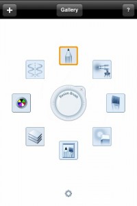
There’s a little symbol in the bottom centre of the screen that you tap to bring up the Tools menu (which Autodesk seem to call the Marking Menu for some reason). I found this somewhat reminiscent of the system used in Inspire. I did find the implementation in that app to be consistently annoying – the menu would pop up at inopportune times and just generally get in the way. The painting menu in SketchBook is an altogether slicker and more comprehensive affair. It took a little time to get used to tapping the symbol to bring up the tools as the area you tap is away from where the menu appears. I’m not saying that’s wrong (it does mean the menu doesn’t pop up unnecessary) but I did find it a little clunky and never felt fully comfortable with it even though it did become easier over time.
 Marking (Tools) Menu
This is arranged in a ring around the central width control. To change the brush/eraser size you tap in the middle of the control and drag left to decrease or right to increase the brush width. This works nicely but as you drag, the width is only shown as a number which is difficult to relate to. It would be much more intuitive if there was a visual indication with a circular outline appearing on screen, changing as you adjust the width.
The eight tools are arranged, compass like, around the central control. In the ‘north’ position is the pencil tool, then moving clockwise, you get the airbrush, paintbrush, eraser, brushes screen, layer editor, colour selection and symmetry.
Eraser
Given that this app features layers, it’s necessary to have an eraser tool. You’ve the option of a hard or soft edged eraser, chosen in the Brush screen. The problem is that SketchBook doesn’t remember your selection. The default is hard edged and that’s what you’ll get each time you choose the eraser from the tools menu. To get the alternative, you have to select it in the brush screen. Surely it would be better to be able to park whichever version you preferred in the Tool menu so it was more easily available?
As I was using it, I found myself wanting the eraser to have an indication on screen of its size so I’d know where the edges were. I think this would largely be solved with a circle being drawn on screen showing the eraser’s edges. This wouldn’t help much when it was small (i.e. smaller than your finger) but the problem tended to occur when it was larger and I didn’t want to accidentally erase parts of my drawing.
 Brushes Screen
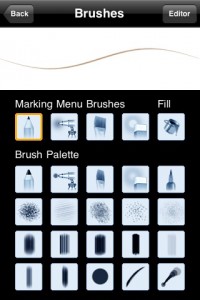
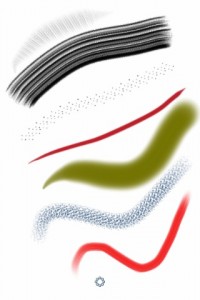
Many users of painting apps like to have a good selection of different brushes to choose from and SketchBook delivers. At the top of the screen is a preview of the brush stroke. Directly below this is a row of icons called the ‘Marking Menu Brushes’ along with a Fill bucket. Under that row is a grid of 20 different tools.
This screen puzzled me for a while. My initial assumption when I saw it was that you choose the type of brush you want to appear on the Marking Menu from the main selection, perhaps by dragging it onto the top row. Nope. The brushes that appear on the marking menu stay the same. If you choose a different tool here and hit ‘Back’ it’s the one you’ll be painting with. Enable the marking menu and choose one of the three available and it’ll change back to that. If you want to select another after that you have to go back into the brush screen to do it.
There’s nothing really wrong with this arrangement except I can’t help feeling my initial assumption was preferable. Wouldn’t it be better to select which brush you want to paint with, the pencil you draw with and which airbrush to have as your default? But things aren’t that simple and it turns out the ‘Edit’ button allows you to make some minor changes to the default brushes.
Fill
Before I get to editing brushes, I should take a small diversion to mention that the Fill tool is selected from the brush menu. As it’s not something you need to use that often, being tucked away in here seems fair enough.
For anyone most familiar with fill tools from other iPhone painting apps, you’ll probably be surprised at how this one works. Rather than just fill the whole layer as in other apps, this one acts like a flood fill bucket from a desktop app, filling the area outward from where it’s dropped, until it meets a boundary. This means separate areas can be filled with different colours. It does have its limitations though. It only acts on the current layer (i.e. doesn’t stop if it comes across a line on a different layer. It also only fills flat colours rather than having a choice of filling as a gradient as you might expect in a desktop application. Even so, it’s a pleasant surprise to have this added functionality on a basic tool.
 Edit Brushes
On the Brushes screen is a tempting button on the top right called ‘Editor’. Diving into this opens up the possibilities you have with the brushes even further. If the 20 or more brushes weren’t enough for you, this screen allows the chance to tweak them. Before I go into it too much, let me take another slight but necessary diversion.
Simulated Pressure Sensitivity
When I read one of the features of SketchBook Mobile was that it simulated pressure sensitivity, I became very interested. During my time with Brushes, there were a few moments when I thought something very clever was going on under the hood as it felt as if the app somehow took the pressure of my finger into account. That was clearly impossible but it did lead to the notion that if Apple allowed developers access to the finger’s contact patch information in the SDK, a passable pseudo pressure effect might be possible. Reading about SketchBook’s simulated pressure caused me to wonder. Had Autodesk somehow gotten access to the contact patch data allowing them to produce this amazing new feature?
In a word, no. Try as I might, pressing my finger onto the screen had little effect on the stroke no matter how hard or soft I pressed. After my initial disappointment I took some time to figure out exactly what this simulated pressure thing of Autodesks is. Select, say, the pencil, make a stroke and you won’t get the uniform line you might expect from other apps. The mark will start thin and grow into the normal sized line, tapering off again at the end. Make a series of swift strokes and they’ll have a different character to slow, deliberate ones. So, what’s going on?
I was frustrated by the apps lack of help or documentation on this, of all areas in the app, as it’s clearly the one that requires it the most. In the absence of any official explanation, I had to experiment myself to try and work it out. Here’s what I found.
 Edit Brushes again
In the Edit screen, you’re able to adjust whether the marks are Soft, Solid or Hard. This simply refers to the edge of the stroke dictating how soft or sharp it will be.
Complication starts to creep in with tools to adjust the Radius, Opacity and Spacing of strokes. It seems that these settings are applied to your stroke depending entirely (as far as I could tell) on the speed you make it. Make a quick stroke and not only is the taper of the mark elongated but it’s thickness will be the minimum Radius set and much of its ‘density’ will depend on the minimum opacity. Likewise, make a slow, deliberate stroke and it’s thicker and darker depending on the maximum settings for radius and opacity but with a very short taper.
Once I’d worked this out, it did strike me as a pretty simplistic setup with which to emulate naturalistic strokes. However, it has to be said that, when I put all the technicalities out of my head and simply drew normally, the strokes started to look quite realistic. It started to look (and feel) much more like sketching than with any other app. So, while I still have to wait for better pseudo pressure sensitivity to appear on the iPhone, this is a passable facsimile for the time being.
Any changes you make to a brush in the edit screen stays with it until you adjust it again or reset it back to the factory defaults (found under the ‘?’ button on the painting screen). So, in this way you can change the default ‘marking’ tools somewhat. It’s clearly limited primarily to the thickness and opacity leaving you unable to change the shape of the mark made but I found it surprisingly useful to be able to tweak various brushes.
 Layers Editor
A new painting will start with only one layer but opening this screen allows you to add up to five more if you’re running on an iPhone 3GS but only two more on other devices (apparently this limitation also applies to even the most recent iPod Touches). On this screen you can add a new layer, load in a photo as a new layer and rearrange them in the familiar iPhone manner by dragging the three line icon up and down. You can also merge the current layer with the one below and turn each layer’s visibility on and off.
Considering this is the third and most recent painting app I’ve seen that incorporates layers and especially since it comes from a big software company, it’s surprising that this implementation of layers is easily the most crude. It doesn’t hold a candle to the style used in Brushes let alone the slick 3D interface of Layers. Don’t get me wrong, it works but where the rest of the app shows a hefty dollop of design both in functionality and visual appeal, the layers editor seems rudimentary in comparison. It leaves the definite impression of being something of an afterthought.
Colour Screen
This is an interesting take on colour selection. When you launch this screen you’re shown a grid of swatches (i.e. pre-selected colours). Tapping on one selects it and returns you to the painting screen. If you want a wider choice, hit the ‘Wheel’ button and you’re given a colour wheel to play with. 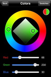 This is a little different to the wheels you’ll find in most painting apps. It features an outer ring showing all the hues with a diamond inside for the saturation (left/right) and brightness (up/down). Below it are RGB (Red, Green, Blue) sliders to allow precise colour selection should you need it. This seems a little unnecessary on an iPhone but given that it’s there, it strikes me that sliders aren’t the best way to input precise numbers.
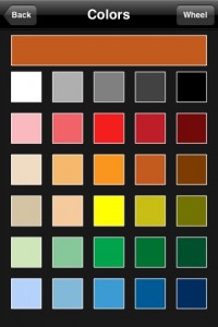
Pressing ‘Back’ from here takes you to the painting screen with the ‘Swatches’ button returning you to the colour grid. Here, you can keep your brand new colour for future use by dragging it from the bar at the top of the screen into any of the swatches in the grid. This is something I’ve wanted since I tried my first iPhone Painting app and, although I’d welcome more slots to use, it works well.
Symmetry
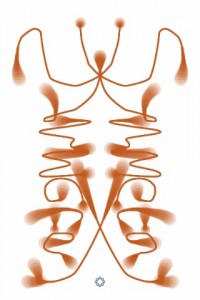
This is a unique tool among serious iPhone painting apps in my experience. Turning this on means all your strokes will be mirrored around the vertical centre of your canvas. Paint a line of the right hand side of the screen and it will be replicated in reverse on the left.
Although it seemed a little odd to begin with, this could prove more useful than you might expect. Drawing a stylised or cartoon face is made easier but I can’t see much use for it with a serious portrait as you’re unlikely to draw a subject straight on and people don’t have perfectly symmetrical faces.
During the whole of my time with SketchBook, I was convinced it didn’t do symmetry in the other direction (i.e. horizontally). Then, watching the promo video (at the end of this review), showed it being done. The trick is to turn your device to landscape orientation before turning on symmetry. Easy when you know how.
Drawing and Painting
Rummaging through a new box of tools is fine but it’s only when you use them that you find out how good they are at getting the job done. So, following my usual habit, I chose to draw a picture of a famous figure electing, on this occasion, Ricky Gervais (I thought it particularly worth mentioning who it was meant to be as I didn’t have time to get the best likeness in the world). The painting tools available in SketchBook are broadly similar to the other painting apps I’ve reviewed (those without a blend tool at least) so, rather than create a painting as I have for previous apps of this type, I thought I’d play to its strengths and concentrate on a pencil drawing this time. In the real world, my favoured medium is pencil on paper – it’s where I produce my best work and I slowly found myself favouring that style while experimenting with SketchBook.
During the later stages, I found one particular brush to be extremely useful. It features a series of thin, parallel lines similar to the sort of mark I’d normally make to shade a drawing. When you overlay a series of strokes such as this at differing angles, you produce cross hatching. The same marks could be produced ‘manually’ but it would be a slow, laborious process. Having a pre-made brush that replicates this is a great idea and makes it easily my favourite non standard brush to be found in any painting app I’ve tried. I should say the list isn’t long as I rarely find a use for the secondary brushes provided.
Once I forgot the technicalities of the software I found that sketching really comes naturally in SketchBook. I would concentrate on one area of the drawing, zooming in to add some detail, then when I looked at the picture as a whole, I’d be surprised at how much it looked like a real pencil drawing.
As with a number of Painting apps, Sketchbook doesn’t cater for ‘landscape’ orientation (let alone upside down). This never ceases to baffle me and I can only hope it’s fixed in a future update.
 Zooming
As you’d expect, this is easily achieved via a pinch but SketchBook gives you the most generous range I’ve yet seen – from 20% right in to 2500% which I found very useful for working on small details.
Performance
SketchBook’s the most laggy painting app I’ve tried. On the one hand, given that I have a 1st generation iPod Touch, you might expect it to be slow but on the other, running on my old hardware means it’s limited to 3 layers (rather than the 6 of a 3GS) and the resolution is clamped to 600×400 (as opposed to 1024×682 on the latest hardware). So, given I’m already paying the price for using a slow device with cut down features, shouldn’t I expect it to run well? The question comes down to ‘is it still usable?’ and I’d have to say a definite yes but I did have to modify my behaviour by often waiting to check the results of my strokes before continuing.
Help
Although you’re given a quick tour to get you started and a slightly more extensive help screen inside, there were a couple of areas I needed detailed help on and wasn’t available. I searched for a manual online to no avail. As I mentioned earlier, help is most noticeably absent (and needed) on how the Brush screen works, the effects of editing them and an overview of the simulated pressure sensitivity.
I’d suggest someone with no previous experience of the desktop application be put in charge of writing the Help. While little is needed for most of the application, the lack of any explanation in several key areas leaves users to fend for themselves which is pretty unforgivable.
Exporting
You can email a PNG file directly from SketchBook or save a copy into your camera roll. With my drawing, I found the former was much the best option as saving to JPG (with its compression) resulted in much of the subtle shading in my portrait being lost. This won’t apply to all work of course but it does hi light the possible problems you might come across with pencil work.
It would be nice if there were more export (and import) options in SketchBook. Given that it uses layers, the ideal would be for it to export (and import) PSD files. This Photoshop format would allow all layer and transparency information to be kept in a lossless file. Ideally, all painting apps would adopt this convention, allowing users to move their work between them to take advantage of their strengths. I can see myself sketching in SketchBook then moving into Inspire to paint. It would require somewhere for all apps to import files from (email attachments, perhaps) but it would be a welcome addition.
Verdict
You can certainly tell this is the direct descendent of a bigger desktop application. In most areas the pedigree of its thoroughly designed and tested code gives it a polish that’s often lacking in similar apps. But in one or two areas it’s surprisingly hum drum – its implementation of layers being the obvious example.
I initially approached SketchBook as another Painting app. Viewed in that way it suffers. It doesn’t have the range of tools PhotoForge has or the paint simulation of Inspire. But, it has the best box of pencils of the lot and viewed in that way, it’s impressive. I’d suggest Autodesk expand on this by introducing effects for different grades of pencil (and charcoal?) and differing textures of paper. Specialise in that area and SketchBook will really cut out its own niche in the Painting app genre – actually, it would create its own Drawing genre.
I will head back to Inspire and its fabulous blending abilities when I feel the need for colour. SketchBook, I’ll save for times when I just want to sketch. It’s the best pencil simulator currently to be had on the iPhone and until Apple allows developers access to the finger contact patch info’, or Corel release a version of Painter for the iPhone, it’s likely to remain so.
Here’s a video of SketchBook Mobile in action

Version 1.1 update
I don’t usually cover updates to apps I’ve already reviewed (who’d have time to eat or sleep if they did that?) but I thought I’d make an exception with the recent V1.1 update to SketchBook Mobile as there’re a couple of aspects to it of interest.
If you’re anything like me, you’ll have experienced the little thrill that occurs whenever you connect to your network and a red badge pops up over the ‘App Store’ icon telling you an update or two is available. It’s a bit like a mini Christmas with bug fixes equating to clothes from your Granny (necessary but boring) and new features being the Buzz Lightyear (the big, flashy electronic gizmo that you’ve been looking forward to for months). Oooh, I love updates.
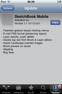 When you dive in to the App Store, up comes a screen listing the changes. Here’s what it said for the SketchBook update (I always grab these so I can check them in detail later).
Does anything strike you about this (apart from the missing icon – I’ve been getting that sometimes lately)? Not exactly packed with useful detail or explanation, is it? Take that first line for example:
“Patented gesture-based marking menus”
What the bloody hell is that supposed to mean? It might as well say “Squiggle flak trumpet sink” for all the sense it makes without explanation. In fairness, most of the rest of the items are less baffling. I get that I can now email a picture in the PSD format, delete a layer or change its opacity and little in the way of help is needed for them.
But some things require more detail. How do I Stipple (and, indeed, many users won’t even know what the term means) and how does the double tap to exit the Brush or Layers screen work? I have to say it’s seems to be in keeping with the original lack of relevant documentation that I mentioned in the main review. Whoever’s responsible for this has forgotten the user who’s unfamiliar with the desktop app and the new features. It’s like he (or she) has been using them for months and forgotten that they’ll be brand new to the users when the update appears.
The tutorial in the app doesn’t mention the new features but I did eventually find reference to the ‘Patented gesture-based marking menus’ in the ‘Help’ screen under a section titled ‘Sketching’. It turns out this refers to a way to quickly access certain tools. You have to press the little circle (marking menu) icon with one finger and use another to tap-drag in the direction of the tool you want from the ‘marking menu’. So, to activate the eraser for example, you’d drag in a South-East direction.
I’m not sure if I’d use this much – after a short time with it, I found it a little awkward but it’s quite possible this will change with practice and there’s always the option to turn it off. I’m puzzled that it’s described as ‘Patented’ as there’s a very similar method employed in the Inspire app which was released earlier but then I’m no expert in patent law.
I was pleased to see a feature I mentioned in the review appear (I’ve no illusions it was down to my mentioning it though). I wanted there to be visual indication of the brush size as you change it and that has now appeared in the update. One slight problem however. It’s placed at the centre of the screen – under your finger in other words, making it tricky to see small brushes. The problem is easily overcome by moving your finger down the screen and dragging it left/right from there but I’d have preferred the indicator to be placed where the numbers appear.
It’s worth mentioning how the double tap feature works as it wasn’t obvious. When you’re in the Brush or Layer screens, you can double tap on any brush (or layer) to quickly select it and get you back to the painting screen. It probably sounds obvious now but without explanation, it’s not clear where you’re meant to double tap on the screen for this to work.
The only other feature that might need a little explanation is the ability to import photos that are in landscape orientation. It’s pretty obvious except it’ll be helpful to know there’s a setting that allows you to decide which direction to turn them on import. This can be found via the ‘Prefs’ screen under then ‘?’ button.
So, a decent update with some interesting new features but please, Autodesk, add a bit of detail and explanatory text for the next update. Your much smaller competitors are putting you to shame in this area.
While I’m here there something that’s been bugging me since I wrote the original review. It strikes me as odd that the sketch Autodesk use to represent the app e.g. in the title screen (i.e. the red robot character) seems to have actually been created in the desktop application. I’ve no doubt that a similar sketch could be produced in SketchBook Mobile so why not create and use that instead? I’d have thought that using the current image is, technically, false advertising as it wasn’t produced using the mobile software which its presence implies. Still, not a big deal, I guess.
Here’s a video showing the update in action:

SketchBook Mobile
Version reviewed: V1.0 (Main review) & V1.1
Category: Entertainment
Developer: Autodesk Inc.
Current Price: £1.79
Works on: iPhone & iPod Touch
