 Painting apps are fast becoming one of the most popular genres on the iPhone judging by the number and quality of new additions. Having reviewed many of the best of this type, I’m always interested to see how developers of new apps go about the task of delivering something bigger and better. On the one hand they can build on the best elements of their successors but it must also be increasingly difficult to offer something new and improved with which to make their mark.
Developer, Sylwester Los of Lucky Clan, says of his new painting app ArtStudio, that “My goal was to create the best (quality, performance, options-wise) drawing/painting app for the iPhone.” That’s quite an ambition and I was keen to find out if he’d succeeded.
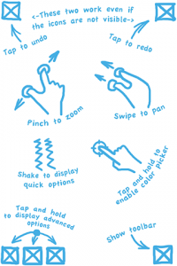 Things get off to a good start when you fire up ArtStudio for the first time and a simple but friendly help screen is displayed showing the main controls (which can be viewed later if necessary via the save/load menu under Tips and Tricks/Quick Tutorial). It turns out there’s plenty more to discover but this is enough to get you going.
Straight away I had a slight feeling of déjà vu. Undo and redo are a simple tap of the top left and top right corners respectively. Hhhhm, reminiscent of SketchBook Mobile but at the top of the screen rather than the bottom. Later, I would get a similar feeling with other features making me think the developer took the best bits of other apps and incorporated them into his. As a user, I’m all in favour of this – I want the best tools and interface designs in one shiny, state of the Art app. No need to re-invent the wheel when someone’s already found a good way to, say, undo a mistake or activate the colour picker.
Interface
The main view consists of little more than a blank page and an arrow in the bottom right corner. Tapping this brings up the toolbar which consists of icons for Brushes, Colour, Layers, Filters, Load/Save, Lessons, Settings and minimise toolbar. Most of these items conceal more than you might expect, the first three particularly.
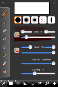
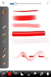
Tapping the Brushes icon brings up a sidebar giving a choice of eight tools including Pencil, Brush, Airbrush, Eraser and Fill. Changing from one to another is a simple case of tapping the appropriate icon. Another touch of the main toolbar icon dismisses the sidebar. But, tap and hold the Brush icon for a second and the extended controls appear, allowing you to make adjustments to the cross section, opacity, spacing and so on. Similar advanced features are also available for Colour and Layers using the tap and hold gesture.
Layers
It’s a measure of the rapid pace of app development that layers, a brand new, cutting edge feature when I reviewed Layers (the application) back in July last year is now a standard tool in any new serious painting app. It’s also a useful yardstick with which to compare the top end apps. The current winner, for me, is the previously mentioned Layers app. Not only does it give you all the functionality you need but presents it in a slick and attractive 3D interface.
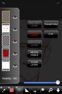
AppStore’s effort is far from the worst version of the layers feature I’ve seen (that goes to the functional but pig ugly effort found in the otherwise slick SketchBook Mobile) and gives you up to five layers to play with (even on my 1st generation iPod Touch) which is a very useable number. If the Beatles can create Sgt. Pepper on a four track, then I can certainly knock up a few sketches using five layers.
You can manipulate layers in all the ways you’d expect. Creating, deleting, merging, flipping, changing opacity and clearing etc. Re-ordering them is easily achieved by dragging one up or down to a new position – simple and intuitive.
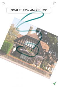 Something I found extremely useful was the ‘Transform’ option which allows you to move, scale and rotate the selected layer. The result is that I could work on a particular part of a drawing (the nose, say) on a separate layer then use the transform option to tweak the position, size and rotation until I was happy with it – a huge time saver. The only way I can see this being improved is if you could select an area from an existing layer and create new layers from that selection which would make it easier to fix mistakes. As it stands, you can replicate that functionality by duplicating a layer and erasing everything but the area you want to keep. This will work but is a bit long winded.
The implementation of layers in ArtStudio isn’t perfect though. I discovered it was possible to accidentally draw on the current layer even if its visibility was turned off, which can’t be a good thing. I also stumbled across an odd bug when I was experimenting with creating and deleting layers. I made a new layer, scribbled a few lines then deleted it. Shortly after, I created another new layer to find it appear complete with my previous scribbles. I couldn’t replicate this so came to the conclusion it was a bug rather than a feature.
Filters
Next stop along the toolbar is a button for various filters. Selecting this option allows you to choose from such effects as inverting the colours, blurring the image, edge detect, embossing and a couple of others. Apart from possibly needing to sharpen the occasional photo, I can’t really imagine much of a use for these myself but perhaps others will.
Save/Load
Here you create a new painting, save, load and export your images or import an existing photo. You can also view the online Flickr gallery of images created by other ArtStudio users as well as submit your own. Oddly, the help options and ‘About’ screen are here which I would’ve thought should more logically be found in the settings screen.
The Tips & Tricks button leads you to the Quick Tutorial page seen when the app’s first started and also a list of useful tips for the app.
 Drawing Lessons
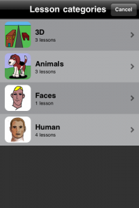
ArtStudio features something unique in top end painting applications – drawing lessons. I was pleased to see this included as it’s something I’d want to add if I was developing my own drawing app. There are eleven lessons included, mostly covering faces with three each on cartoon animals and perspective. The lessons can be viewed either by playing back all the steps as a continuous video or as a series of steps drawn by the app which the user then has to effectively trace.
Be careful when starting a lesson as you won’t be prompted to save your current painting so any work done since the last save will be lost. Also, when you get to the end and want to save the image, be sure to select the ‘Save a copy’ option otherwise you’ll overwrite your own work. The best bet is to hit the ‘New Image’ button before starting the lessons.
While I applaud the aim, I found the lessons frustrating as it very much feels like a wasted opportunity. They amount to a series of ‘trace this line’ actions and while this might amuse a child for a short time it does little to truly educate a novice wanting to learn how to draw. As an educational tool, they are no better than a painting by numbers kit.
In fairness, there are a couple that hint at being useful, the perspective lessons and the one named ‘Head Proportions’. But what they still lack is any kind of explanation of what the user is seeing, what use it is and how to apply it in their own work. In a word, disappointing.
Settings
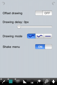
For an app with so many features, there are surprisingly few settings. You can elect to enable a drawing offset (so the mark appears above your finger rather than under it). There’s also a Drawing delay control which I could find no good use for. Add to this a drawing mode to create straight lines and an option to turn off the shake menu.
Shake menu
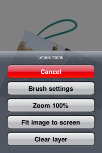
A gentle shake of your device brings up several options: Brush Settings, Zoom 100%, Fit image to screen and Clear Layer. The only useful options (well, the only ones that can’t easily be invoked any other way) are the ‘100% Zoom’ and ‘Fit image to screen’ which alone makes the shake menu invaluable for reasons I’ll explain later.
Ok, them’s the tools but what can you do with them?
Painting
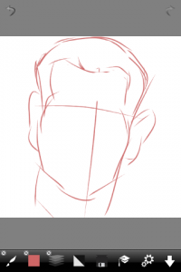
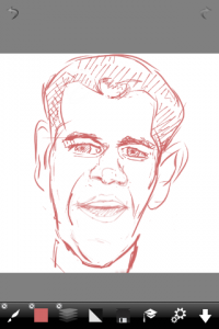
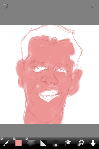
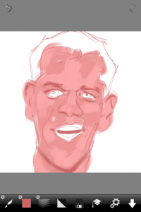
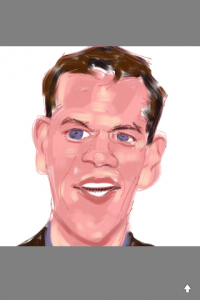
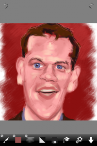
As per my usual habit when reviewing a painting app, I decided to test it by drawing a caricature of some famous face and Matt Damon’s the victim this time. That decided, the next step is to create a new painting in Art Studio. This is done via the Save/Load menu. Here you’re given the choice of a 320×480, 342×512, 512×342 or 512×512 canvas (iPhone 3GS and 3rd gen’ Touch users get further choices up to 1024×1024). I’ve never understood why anyone would choose anything less than the highest resolution available so I select the 512×512 size.
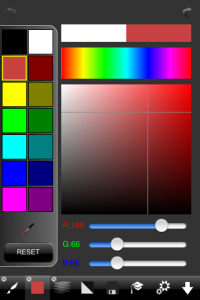
First things first, I tap on the Colour icon and up pops the palette of 14 colours. If none of these are exactly what you’re after, pressing the colour icon for a second or so adds the advanced options. Here you can choose any hue either via the RGB sliders or, more likely, simply by tapping on the spectrum to select a rough colour and homing in on the exact hue/saturation using the larger colour box. This new colour will replace the currently selected swatch in the palette of 14. The original ‘factory default’ colours can easily be recalled either individually or all at once by pressing the ‘Reset’ button. Once a colour is chosen, the palette is dismissed by tapping the colour icon again.
Next, it’s time to select a drawing tool and a tap of the Brush icon brings up the sidebar with a choice of 8 tools as well as a slider to adjust the brush size. Again, a longer press of the icon adds the advanced options which allow you to adjust various aspects of the stroke. Déjà vu rears up again here as ArtStudio features a very similar ‘simulated pressure sensitivity’ effect to that found in SketchBook Mobile which translates to being able to taper the start and end of a stroke depending on the swipe speed. A simple but effective trick and one you can tweak by adjusting the parameters on the advanced screen. If that doesn’t appeal, you can leave these options well alone and simply use the defaults quite happily.
The same advanced controls are available for most of the drawing tools except smudge and fill bucket.
Smudge
Anyone who’s read any of my previous painting app reviews will be aware of a personal hobby horse of mine, the smudge tool. As far as I’m concerned this is a must for any serious painting app. The reason being the time it saves blending two or more colours together. The good news is ArtStudio includes a smudge tool. The bad news is that it doesn’t hold a candle to the excellent blend tool featured in Inspire but then, I’ve yet to find another painting app that does.
Fill Bucket
The Fill tool features ‘Smart Filling’ which translates to the ability to fill a shape as you’d hope rather than having ugly gaps where the fill colour meets the anti-aliased edges of the boundary line. If that’s Greek to you, don’t worry, just know that fill works as you’d want it to.
Once I got to grips with changing colours and selecting the right drawing tool, I made quick progress in ArtStudio. The sidebar idea works well – allowing you to select a colour or tool without obscuring the drawing surface and dismissing it altogether is only a tap away. This results in speedy progress and very little frustration from the interface butting in unnecessarily.
After a time, I found the main reason I’d need to bring up the advanced options on the brush screen was to adjust the opacity. Although you get the size slider when either the colour or brush sidebar is up, you have to dive down a bit further to adjust the opacity. I wonder if it would be feasible for the developer to add an extra slider under the brush size to save that extra tap or two?
Dodge & Burn please
Now that all the serious painting apps sport smudge and layer tools, the next major feature I’d like them to add are Dodge and Burn. These would allow users to easily lighten and darken colours meaning less need to fiddle around trying to find a colour’s neighbouring hi-light and shadow tones. Currently I have to select the area’s colour, dive into the colour screen (to lighten or darken) then apply it manually. Dodge and Burn would speed this part of the process up greatly and I’d happily trade all the filters for these two tools if necessary.
Orienteering
Frustratingly, I’ve yet to come across a painting app that handles drawing in landscape and upside down as it should (in my opinion anyway) and ArtStudio is no exception. Surely an Artist should be able to turn their iPhone on its side (either side of course) and the tools rotate accordingly so they are in the same relative position? And for those of us who regularly want to draw upside down, it should be even easier to rotate the controls 180 degrees while keeping the canvas facing the same way? Why developers neglect these details is beyond me – perhaps it’s a great deal more difficult to code than I’m led to believe. I can imagine rearranging the toolbars to fit a landscape orientation may be troublesome but simply rotating them 180 degrees for upside down must be a doddle, surely?
 Zoom
Zoom
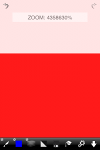
One of the boasts for the app in the AppStore blurb is that it features unlimited zoom. While I didn’t have time to test that thoroughly (infinity takes a while to get to – I’d have to change the laws of physics first and I can’t be bothered right now), you can see from the screenshot that it doesn’t disappoint. The only problem with this enormous range is quickly getting back to 100% which can only (as far as I could tell) be jumped back to by using the ‘Zoom 100%’ or ‘Fit to screen’ buttons in the shake menu, making it invaluable. While an unlimited zoom is nice in theory, I couldn’t help but wonder why you’d ever want to zoom beyond the point where one pixel is filling the whole screen. Still, I guess it allows for larger canvases in the future.
Undo Redo
ArtStudio features an Undo/Redo system that allows an “almost infinite” number of steps. Quite what ‘almost infinite’ means is anyone’s guess (infinity -1 perhaps?) but I didn’t find cause to doubt the claim and it worked fine.
Once I’d learned the tools and how to use them, I found painting with ArtStudio a reasonably pleasant experience. The interface is a little quirky but generally keeps out of your way and is certainly less aggravating than many similar apps.
Talking of quirks, ArtStudio has its fair share. I got the distinct feeling that the app hadn’t been put through enough testing to iron out all the niggles. Whether it’s bugs or feature, erm, foibles, ArtStudio isn’t the entirely trouble free experience it should be. For example, there were occasions when I’d hit ‘Save’ and be given the option to overwrite the current file or save a copy. Then, at other times, it would just overwrite without asking.
It also crashed. This is far from unheard of but in this case it caused me to lose work which I had to recreate. Imagine what that did for my peace of mind for the remainder of the time I worked on my painting.
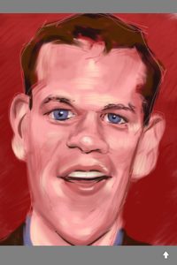 Verdict
So has developer, Sylwester Los achieved his goal of creating the best drawing/painting app for the iPhone?
Well, using his three criteria, in terms of quality, there are certainly bugs to be found. This I usually tolerate in early versions of an iPhone app but this one caused me to lose work which is pretty unforgivable. However, I’m going to assume it was down to me not rebooting my Touch after installation. And, in fairness, I didn’t lose work after I’d done that. So, as for quality… I’m going to give it the benefit of the doubt and assume this will improve in future versions. I should also mention the majority of my review was done using version 1.21 but as I was finishing it, V2.0 was released and during my time using that, it seemed to behave itself better.
I’ve no complaints regarding performance. Assuming that means speed of operation, I had no slow down issues while using it on my 1st Gen’ iPod Touch so that gets a big thumbs up.
As for what the developer calls ‘options’, this is where ArtStudio scores. It’s loaded with features and reminds me of an old favourite, PhotoForge. Not only has it got enough painting tools to keep most Artists happy, but it also contains some photographic features such as Sepia and Invert Colours filters. As an Artist, I’d much rather have a Dodge and Burn tool than the filters (or Lessons) and I’d prefer the sublime blend tool of Inspire rather than the crude (and aptly named) smudge included in ArtStudio (and most other painting apps).
Still, when it comes to value for money, ArtStudio certainly gives you a lot of toys to play with. But if you’re judging it by the feature list, I’d suggest you go for the similarly feature packed PhotoForge as it feels more reliable to use and has a slightly slicker interface. For pure painting though (despite its somewhat clunky interface), nothing has yet to beat Inspire.
At the moment, ArtStudio feels rather too flaky and unpolished but I can see it, in time, becoming a worthy choice in the crowded painting app field.
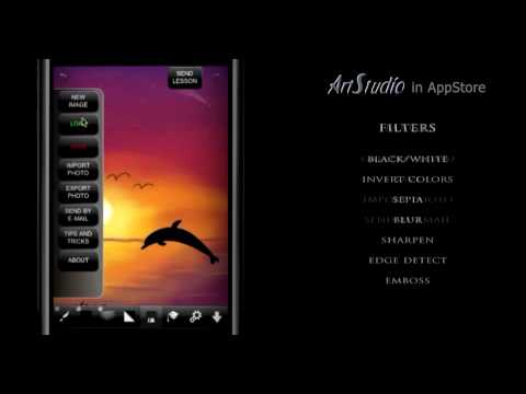
Here’s a video of ArtStudio in action:
ArtStudio
Version reviewed: V2.0
Category: Photography
Developer: Lucky Clan
Current Price: £2.39
Platforms: iPhone, iPod Touch (version reviewed), iPad
UK App Store Link

