 The native calendar app on the iOS is one of its weakest features but one that seems common among mobile devices. All of my past phones had poor native calendars that needed replacing with better third party options and the iPhone is no exception.
I’ve previously looked at Pocket Informant and was very impressed. The regular updates since my review have meant it continues to be an excellent replacement. After all this time though, I was curious to see if PI now had serious competition with the appearance of Agendus from iambic inc.
Agendus is a name I’ve been aware of for many years. It’s calendaring software available on every major mobile platform but, for some reason, one I’ve yet to try. It’s been going since the digital stone age (or about 1999 if you prefer) – not quite as old as the fondly remembered Psion Agenda but certainly one of the elders. With all that time to develop and mature, I was expecting a smooth and pleasant experience.
 Starting off
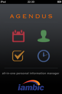
When you run Agendus, the title screen proclaims it to be an ‘All in one personal information manager’. While I was impressed with the ambition of the developers, I did wonder if it could live up to that aim and my initial impression didn’t turn out to be good.
One thing becomes very obvious straight from the off. Agendus is designed on the assumption it would be running on a device that’s always connected and for an app that supports the iPod Touch (such as my 1st gen model), that clearly won’t be the case. You may find, as I did, you’ll encounter a few quirks when it’s run with your Wi-Fi connection off.
After confirming I wanted to sync with my Google account and inputting my user information, I was greeted with an obscure error message rather than the more useful suggestion that I turn on my Wi-Fi connection and try again. Ok, so after backing out of the app, turning Wi-Fi on and trying again, it connected to Google calendar and synced my data with no further problems – that’s more like it. At this point you’re greeted with one of five screens Agendus uses, the Today view.
Today
This unsurprisingly lists any events and tasks due today but also has slots for ‘quote of the day’, ‘this day in history’ and weather. I’ve never been a ‘quote of the day’ fan but I do like ‘this day in history’ (as long as it isn’t too America-centric) and discovered that a tap brought up another example (assuming you were still online of course). I was pleased to later find the option to choose which items to show on this screen – goodbye ‘quote of the day’.
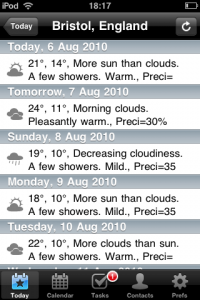
The weather slot requires a tap to change from the default Californian location to your own home town but once it’s updated, another tap brings up the forecast for the following eight days. If you prefer your temperatures spelt with a C rather than an F, there’s an option in the settings screen to display them in Celsius.
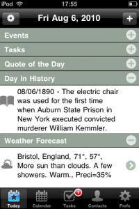 A problem that doesn’t become clear until you use it for a few days is the fact the weather doesn’t update automatically. The trouble is the summary forecast given on the main Today view isn’t dated so you’re left wondering when it relates to. Although appearing on the ‘Today’ screen, it might actually be a previous days weather. To update it, you have to move into the 9 day forecast page and hit the refresh button which strikes me as unnecessarily cumbersome.
Each item in the Today screen (Events, Tasks etc) has a plus or minus icon on the right hand side to expand and contract them. Very quickly, I noticed a couple of problems with this screen. Attempting to press the + icon for the top line (Events) actually brings up the ‘Add Items’ pane about 80% of the time. This happens because the two icons are so close together, precisely hitting the ‘+’ icon to expand the line without accidentally tapping the ‘+’ icon to add an entry requires the skill and precision of a keyhole surgeon.
Secondly, When the Events or Tasks panels are rolled up there’s no visual indication whether they contain any items, requiring you to open them to find out. When they’re empty, pressing the icon simply toggles it between + and – with no other visual indication.
Above all this though, is the feeling the space is poorly used. Not only are there two icons to get you to the Settings screen (a specific Today view cog icon on the top left and a different cog icon at the bottom right that takes you to the general options page) but each item seems fatter than it need be and, with no way to zoom out, the screen real estate seems to be used rather inefficiently.
 Calendar
This screen offers several views:
– Day
– List
– Week
– Month
– Year
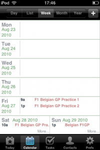
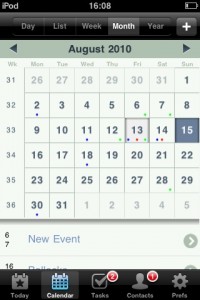
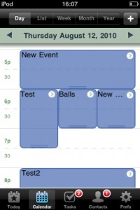
Each of them display your events much as you’d expect and each event is made up with the traditional title, location, due date, contact, alarm, notes etc. You can also assign an icon to it from a selection of 69 that come built into the app.
Tapping in a time slot within the Day view instantly adds a new event. This sounds very convenient until the you find yourself doing it accidentally, time after time. This quickly becomes maddening when you find more and more actions get misinterpreted for an ‘add event’ tap. For example, according to the tutorial video, a simple tap on the top of an event allows you to drag it to a different time slot. It might when using the mouse in the iPhone simulator as featured in the video (actually, even there it takes several attempts) but in the real world, I found this almost impossible. What happens is you scroll the view down a little to give yourself space (probably invoking an unwanted ‘add event’ action in the process) then, very carefully, tap and hold on the top edge of the event (as seen in the video) and guess what? Another unwanted ‘add event’ occurs.
What makes this absolutely infuriating is the fact that when the keyboard pops up for you to add text to the event, there’s no cancel button! You’re forced to create this unwanted event. After much experimentation and investigation, I discovered a shake seems to (eventually) dismiss the keyboard but still leaves you with an unwanted ‘New Event’.
So, after making a dozen unwanted events, it’ll be a simple swipe to delete them, right? Wrong. Swiping or tapping on the event brings the keyboard back so what you have to do for each item is very carefully hit the tiny ‘>’ arrow in the upper right corner of its box to bring up the ‘View Event’ screen (although you’ll inevitably spark off another ‘add event’ action half the time). Here you’ll find the delete event button which you press and confirm. At best, three taps (assuming you get lucky and not kick off multiple new event actions in the process) instead of a simple swipe and tap to delete.
Another problem (admittedly minor in comparison to most others) is the fact that ‘all day’ events and tasks (even ones with a due time) are parked off the top of the day view at the midnight position. Unless you’re in the habit of scrolling to the top of the screen every day you look at, you’ll never see them in this view.
By comparison, the other views were a joy to use. Don’t get me wrong, they were still rather poor by normal standards but compared to using the Day view, they were a delight.
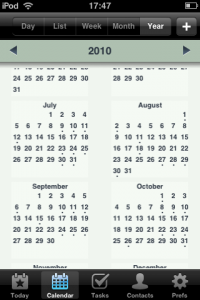
I should note that Agendus includes a year view (something Pocket Informant lacks) but as welcome as it was, it didn’t seem to use the space well and every change of year prompted another pause with only a ‘Loading Events’ popup for entertainment. It was here I first noticed the lack of support for landscape orientation. Every calendar view would benefit from this option but there is zero support for it in Agendus.
For a long time, I hunted around for a way to return to today’s date in these various views. It’s not obvious but I eventually discovered that a shake does it. Personally, I’d prefer a button or possibly a double tap on the title bar to get the same effect – I’ve never been a fan of the shake action.
Tasks
Here you can add a task and assign it a category, due date, icon and add some notes. There’s no pretence at using the GTD philosophy (which, not being a fan, is fine with me) and the tasks, although simple, do their job well enough.
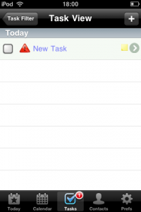 I was surprised and disappointed to find the tasks didn’t sync to an online service such as ToodleDo or Remember the Milk. Having become accustomed to this functionality in Pocket Informant and seeing the other items sync to Google Calendar, I’d assumed Agendus would allow for tasks to be synced to the cloud somewhere. The idea of them not being backed up makes me a little nervous and I also miss the ability to use my PC to type long notes or easily add several new tasks when I need to.
Contacts
This screen puzzled me. Why would I want my contacts duplicated in my calendar app I wondered. On first inspection it offers little more than the native Contacts app but does provide a ‘Birthdays’ view listing everyone whose birth date you’ve added in upcoming order as well as showing how old they’ll be. Useful I suppose but it seems rather unnecessary – your opinion may differ of course especially if you’re using an iPhone which means you’ll be able to dial direct from this view.
The manual suggests Agendus adds valuable functionality to the contacts by integrating it into various aspects of your tasks and calendar (i.e. adding a contact to a calendar or todo entry). I wasn’t convinced by this and more than a little wary (possibly unfairly) of the fact that Agendus seems to be able to write to the native Contacts file. Given the lack of polish evident in most other areas of Agendus, I wasn’t happy for it to mess with my contacts and wished there was the option to disable it.
Prefs
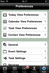
As you’d expect, there are options here to change many aspects of the software including selection and rearrangement of the items on the Today view and much else besides. It also includes two items that caused me to shoot tea out of my nose but I’ll come to those later.
 Help
Help
I always like to first try using an app ‘blind’ before diving into any documentation as this gives me a good idea how well designed and easy to use it is. Agendus faired pretty well here. I was able to operate it successfully before looking at the documentation (or even the demo video). Much of this is down to the simplicity of the app. It isn’t packed with features and you’d expect it to be reasonably straightforward to get your head around and so it proved.
When you first start Agendus, you’re offered the chance to watch a brief (online) tutorial video. You can also get to this via an option in the prefs screen (or find it located at the end of this review). As I didn’t see it before jumping in (I wasn’t connected to the net, remember), I chose to avoid watching this as part of my ‘dive in with no instruction and see how well you get on’ approach. Watching it later revealed a couple of surprises. The main one was the ‘shake to return to today’ functionality. I’d already tried that when I first looked at the calendar but it hadn’t worked for me. So I tried again and it still didn’t work and so I tried again with a really exaggerated shake and… it worked! And it’s worked ever since. As much as I’d like to blame Agendus for this, I’m happy to put this one down as my fault.
Another titbit gleaned from the video was the ability to move an event or change its duration by dragging the upper or lower edge in the Day view. I found changing the duration worked well enough but dragging the top proved almost impossible as I’ve already explained.
I’m always pleased to see developers taking the time to provide detailed support for their apps whether it’s in the form of an ‘onboard’ help screen, website, video or, as in this case, a downloadable PDF manual. I found this oddly in keeping with the rest of the app. Superficially, it did the job but spend any time with it and little quirks and oddities soon show up (“The upper portion of the screen displays an common full-month”). I also found reference to ‘Day View Preferences’ which would supposedly allow me to set the start time for a day. Search as I might, I couldn’t find it in the app and an email to the developer confirmed it’s a mistake which needs to be removed from the manual. The lesson from this? I hope they take the trouble to get the next version of the manual properly tested and proof read.
Future features
Planned features include integration with the built-in iPhone calendar and a desktop version to synchronise with (although I’m not sure if that’ll be Windows, Mac or both). I’m also told the developers are on the verge of releasing an iPad version and I’ll be curious to see how it differs from the iPhone and how well they’ll fair, designing the interface.
Verdict
This has been the most difficult app review I’ve written so far.
You know in the Pink Panther films, the way every little thing Inspector Clouseau does infuriates his boss, Dreyfus to the point where Dreyfus develops a nervous twitch and wants to cause physical harm to Clouseau every time he sees him? That’s a pretty accurate reflection of my time with Agendus.
I like to believe my reviews are detailed, fair, reasonable and while I express my opinion, offer enough unbiased reporting to allow the reader to draw their own conclusions. This time though, I’ve found it extremely difficult to stop myself shouting incredulously about all its faults and simply writing ‘Don’t buy it!’
I’d assumed that an app with such a long history would be refined and polished to near perfection (it should be shouldn’t it?) but this version at least is frustrating to use with its design and layout feeling rather rushed and badly thought through. Not having experience of Agendus on any other platform, I can’t judge whether this follows the same historic layout and functionality of other versions or is simply a particularly poor implementation.
 Although it’s a little more expensive, Pocket Informant offers more features, better design and largely flawless implementation. It also has regular updates, something I’m unable to judge for Agendus although I know new features are being planned. Perhaps it’s unfair to judge one app against another in terms of numbers of features, after all, Agendus doesn’t claim to do anything that it doesn’t (I’ll be generous and ignore the “All in one personal information manager” line in the title screen). But even if PI only had the same features as Agendus, it would still win easily as they’re designed and implemented so much better – almost as if someone had given it some serious thought, employed competent professionals to implement it and taken the time to test it. Oh, they did.
Is Agendus really that bad? Time and again, when I went to explore the next new part of the app, I’d find some new horror to spoil the experience. The difference between baffling design and poor implementation became blurred as I came across one irritant and another. The annoying wait for ‘Loading Events’ every time it’s started, the weather not being dated on the Today screen, no cancel button when adding a new event in the Day view, design inconsistencies (two cog/settings icons on the Today screen but nowhere else), no support for landscape orientation, being unable to delete unwanted events in the Day view with the standard swipe (it activates the keyboard), the multiple ways to accidentally add a new event in Day view… I could go on.
It got to the point when I started to think these mistakes were deliberate. Surely no-one could make this many wrong decisions? It’s as if the developers had a meeting, decided what all the correct ways to do things were, threw them out and asked themselves ‘what’s the wrong way to do this?’. Don’t believe me? How do you suppose you move from one month to the next in the month view? Swipe horizontally? No. You swipe vertically. I am not kidding. It’s in the manual, check it for yourself – page 18, near the bottom.
That is some radical, free thinking right there. Or do I mean moronic?
As if the poor design and implementation wasn’t enough to make me dislike this app, two items in the settings screen only served to put the nail in the coffin. There’s an item in there to set up your Twitter account. Why? According to the manual, “The Twitter field allows you define which Twitter client to “Tweet the Love” about Agendus.”
Love!? By this point Agendus had provoked many, strong emotional reactions in me but love was most certainly not one of them.
Imagine the state of my blood pressure by this time then consider what seeing the following item did for me. As if supplying shoddy software (that you have to pay for) wasn’t enough, the developer adds insult to injury with the following button, found at the bottom of the options screen:
Yes, ‘Buy’. I did a double take when I spotted that. Of all the money grabbing ways to exploit your users, this struck me as particularly cynical, irksome and insulting. If you’re interested in the details, they’re offering two sets of 48 icons for 99 cents per set. I’d suggest the developers concentrate on improving their software so sales naturally increase and throw in the icons free for their poor, suffering paying customers.
Never before has an app actually made me angry.
I suppose someone, somewhere (presumably with masochistic tendencies and supreme patience) could use Agendus and find it does what they want but, really, why live with that pain when there are much better alternatives? If you’re looking for a replacement Calendar app, install the lite version of Pocket Informant and see how it should be done. I’d offer the same advice to the developers of Agendus too.
Have I gone over the top with my dislike of this app? All I can say is I’ve done my best to deliver a calm, sober reflection of my experience using Agendus despite its best efforts to wind me up (and, indeed, drive me to drink). I’ve had to very deliberately rewrite this review a number of times, toning it way down each time. You should have seen the earlier drafts.
To sum Agendus up in as restrained and objective a way as I can manage: it’s disappointing and very often infuriating.
Here’s a video (released by the developer) of the app in action. Bear in mind it’s a video of the app running in the iPhone simulator where the selection is made not by a human finger but with the pixel precision of a mouse:

Agendus
Version reviewed: V2.3
Category: Productivity
Developer: iambic inc.
Current Price: £4.99
Platforms: iPhone, iPod Touch (version reviewed), iPad (in development)
UK App Store Link

