 We all need a calendar in one form or another. Some prefer the comprehensive, do everything option such as Pocket Informant (a favourite of mine). Others prefer something less complex and ambitious such as the app I recently reviewed called [twitch] Agendus [twitch, twitch]. The less said about ‘the A word’, the better.
Now, though, there’s Refills to play with and it turns out to have a twist that I think has a lot of potential.
It’s full name in iTunes is ‘Refills (for Google Calendar™)’ and, as this suggests, it’s designed to deal with your Google Calendar as opposed to the inbuilt iPhone one. I prefer this approach as syncing with Google Calendar means it’s always backed up, accessible even if I lost my device and allows the option to add entries using a computer when a lot of typing is required.
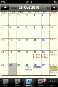 As I use an iPod Touch (and following my experience with [shudder] Agendus), I made sure my Wi-Fi connection was turned on before starting Refills. After pausing to update its holidays database – specific to your country – I was presented with today’s (empty) page.
Toolbar
The toolbar along the bottom gives you quick access to 1 day, 7 day, Monthly and Tasks views. The ‘More’ button leading you to an options page. The first port of call here was ‘Calendars’ to setup my Google account but there was nowhere to input my details. I did see this message however:
“In order to use multiple calendars, you need to setup syncing with Google Calendar.”
Yes, I know but where do I do that? I should point out that, at this point, I hadn’t read the Help screens. I like to play around with the app first, seeing how easy it is to use before digging into the help later. With no other clues, I assumed I would find the Google Calendar options in the iOS settings app (there was nowhere else for them to appear within Refills) but why not mention that in the message above? Sure enough, after coming out of Refills and into the Settings app, I found a pleasing number of options to twiddle with, beginning with your Google account details.
After adding those, I backed out of settings and fired up Refills again. This time (with ‘Sync at startup’ having been selected), my calendars were retrieved without a hitch. Later, I did notice that if I ran Refills while Wi-Fi was off, an error message popped up saying ‘Sync Login Failed’ that had to be manually dismissed before I could get to see my Calendar. I imagine this is another example of a developer making assumptions about their users: they’ll have an iPhone and it’ll always be connected. This would be fine except the app is available for the Touch too which certainly won’t always be connected even if the Wi-Fi was permanently on. Is there a need for an error message to get in the way at this point? Wouldn’t it be more elegant just to sync when there is a connection and carry on serenely when there isn’t? Bit of a rough edge, that.
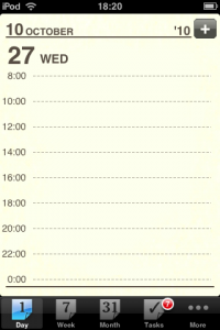 Day View
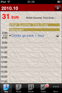
For most, this will be the main view they use in Refills. It’s clean and well presented showing the period you set: 8:00am to midnight by default but the start time is configurable as is the time interval displayed although only with the choice of 1 or 2 hours. Other options include font size and number of lines visible. Similar choices are also available for the other views.
You move easily between days with a left or right swipe and a press of the ’1 Day’ icon on the toolbar always brings you back to ‘today’. One minor gripe is that nothing on screen indicates ‘today’. Unless I’m going blind or missing something very obvious, I couldn’t spot any indication showing which day is today. Other calendars will display today’s date in a different colour or bold or something but not Refills. Seems an odd omission to me.
There’s often a slight pause to load events when moving from one day to the next. I suspect anyone with a device more recent than my 1st gen’ iPod Touch probably wouldn’t experience this but I did find it became quite annoying. It often doesn’t even seem to cache the next and previous days events in preparation for a swipe which would seem an obvious improvement.
Pressing the ‘+’ icon (or double tapping a time slot) allows you to add an event. The usual items appear here such as title, start/finish time, location (where you have to option to use Google maps if you’re online), reminder (unsurprisingly, pop-up reminders from Refills only work if you’re running iOS 4 or above), repeat, notes and so on. All pretty standard and work fine. It is possible to set the time of the event by incorporating it into the title e.g. “3p – 4p Meeting”. This is a nice idea but, when I tried it, I found the iOS spell correction got in the way and the syntax Refills requires wasn’t quite as forgiving as I would have liked. In the end I found it quicker to simply set the time manually rather than using the iOS keyboard.
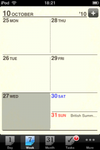 7 Days
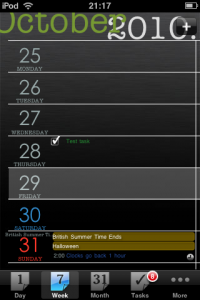
The week view holds no surprises. It shows the period from Monday to Sunday with the start day being configurable. It would be nice to have the option to switch between ‘this week’ (Monday to Sunday) and a next 7 days view (today to 7 days hence) but unfortunately there isn’t.
It initially looked like the week view (and Month view) indicated which day was ‘today’ (unlike the Day view) but it turned out only to indicate the selected day. Tapping on another day moved the highlight, confusing matters somewhat I thought.
Month
Again, little in the way of the unexpected here. The start day is configurable (gotta be Monday for me). Swiping changes the month shown while a double tap opens the day view to that date. I also discovered that tapping the title bar (here and in the other calendar views) brings down a secondary toolbar with a redundant ‘+’ button (there’s one in the top right corner anyway) and another button on the left. This brings up an otherwise hidden set of options: Jump To Today, Jump To Date and Sync Now.
Tasks
The first time I ran Refills, I was a little surprised to see I already had 7 tasks to complete. It turns out these are a few helpful hints to get you going created in the form of tasks. By the way, the first one tells you where to setup Google Calendar settings – nice touch developers but I still say it’s worth mentioning in the options screen.
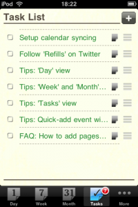 Tapping on the title area in this view brings down a toolbar allowing you to display the tasks by ‘My Order’, Due Date or by Completed. You can also add more task lists by pressing the ‘action button’ on the left and choosing ‘Add Task List’ from the options that appear. Once you have more than one task list, you can move between them with a left/right swipe and relocate each task by editing it and selecting which task list you want it to appear on. You can also easily reorder tasks in a list (when viewed in ‘My Order’) by dragging them up or down.
The most disappointing thing about Tasks, in my view, is the fact they’re not synced to any online service. I prefer PI’s ability to sync tasks to/from Toodledo but many will be happy enough with Refills simple onboard task list and what it does, it does nicely. The developers say that rather than sync to another service, they are waiting until Google allows syncing to its own tasks so, hopefully, that might happen at some point in the future.
Landscape
None of the calendar or task views work in landscape orientation, it’s portrait mode only I’m afraid. In fairness, portrait suits the views better and there’s not much to be gained in landscape mode, with the possible exception of the week view perhaps?
After I’d finished playing with the app and went through all the help and read the developers website, I discovered there is one particular circumstance when Refills throws caution to the wind. When you add or edit an event it’s possible to turn your device and use the larger keyboard available in landscape.
Help
Pressing ‘Help’ in the options/more page opens a web page style document (you don’t have to be online to view it but some links won’t work). This is rather poorly designed for use on the iPhone or Touch as a great deal of zooming and panning is required to read the tiny text, making it much more awkward than it need be. That said, the actual content is clear enough and helpful but the best way to view it is on your computer via this link.
Refill Catalog
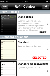
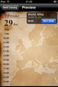
For me, the most interesting aspect of the app showed up when I looked into the ‘Refill Catalog’. I’d assumed it was simply a set of skins that changed a few colours and added the occasional background texture. It turned out to have an unexpected twist with a lot of potential.
Refills gives you option to download and install more skins which are to be found listed in the ‘Refill Catalog’ screen. Some are free while others are 59p. The first skin I tried was called ‘Stone Black’ which, as its name suggests, darkens the pages. I was surprised to discover that as well as the visual alterations, it also included quite a drastic change of layout for the 7 day view (see above, right). Instead of the familiar grid of 6 blocks (a layout I’ve never been a fan of), you get 7 horizontal slots. I rather liked this layout and found myself wanting to use it in the ‘Standard’ skin.
My wish was soon granted as I looked a little further into the ‘catalog’. There are several (free) variations on the default skin, one of which is called ‘Standard (Wide Week View)’. This gave me exactly what I was after in the 7 day screen. Looking further still, the ‘Standard (For Weekenders)’ skin provides another variation where the 7 day view shrinks the weekdays down into one column expanding the size of Saturday and Sunday into their own half of the screen. Presumably, this is for those people with particularly hectic weekends.
 Suddenly, the possibilities of a small feature I’d assumed was just a superficial colour change, widened the potential for the whole app. If more of the view options were made available to change and users allowed to design and create their own skins, customised to their particular needs, this could be a very interesting and unique feature for Refills.
I should stress this is just in my fevered imagination right now. From the examples I saw, only the 7 day view can be dramatically redesigned and users are not able to create their own skins. I can only hope the developer is heading down this road (and Apple’s guidelines allow it).
Verdict
Refills is modest in its ambitions and fulfils them reasonably well. It doesn’t pretend to be anything other than what it is, a pretty, on-device front end for your Google Calendar. Occasional interface quirks such as a needlessly replicated ‘+’ button, no visual indication of ‘today’ in the various calendar views and a couple of items that feel somewhat hidden away aren’t enough to spoil the experience to any great degree.
I don’t usually comment on the price of apps (I figure readers will decide whether an app is worth the cost to them) but I must say that £5.99 does feel too expensive for what Refills offers. This is made worse by the fact there is no free/lite version to try first. For a couple of quid more you could get the most comprehensive Calendar software on iOS, Pocket Informant, and that’s where I’d still spend my Calendar money. But, if you’re ok with the price and just want a nice looking, simple front end for your Google Calendar that you can carry around with you, Refills does a decent, if unremarkable, job.
Potentially, I think the big unique selling point for Refills could be the ability to change skins. At the moment it’s closed and limited but if this was expanded and allowed users to create and use their own skins, I could see Refills carving out a very nice little niche for itself with a genuinely useful and (as far as I know) unique feature.
A calendar app you could customise to fit your needs perfectly? Now that would be worth £5.99
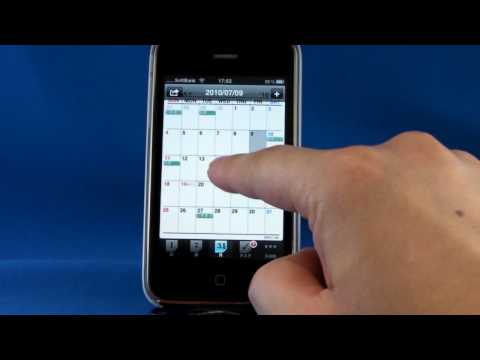
Here’s a video of the app in action:
Refills
Version reviewed: V1.2
Category: Productivity
Developer: KGT Inc.
Price (at time of review): £5.99
Platforms: iPhone, iPod Touch (version reviewed)
UK App Store Link

