It’s Convergence, Jim, but not as we know it…
Regular watchers of my Phones Show will note that I recently did a feature on Convergence, listing ten things which my phone did that used to require separate devices – quite an impressive (theoretical) list of now redundant ancillary bits of hardware.
For my list, I pointedly used the Nokia N82, reckoning it as the ‘most converged device on the planet’ – how would the Apple iPhone hold up against this convergence list? And, more to the point, what about the ways in which it offers extra means of Convergence beyond the original somewhat-Nokia-centric top ten? Let’s find out…. (more…)
App Review: aSleep Kids Edition
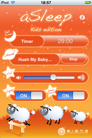
Sometimes an application just cuts to the heart of life in the real world and proves a perfect match. aSleep Kids Edition is such a program – it’s designed for one scenario and one only, but it fulfills its role perfectly, getting your baby or toddler off to sleep reliably and with you in full control, with music, light and sensible power management.

The Cons of the iPod Touch making it big in the world of the Nintendo DS
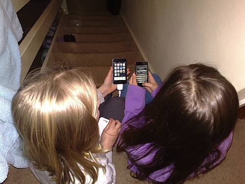
So my daughter’s best friend got an iPod Touch for Christmas. And she brought it round to our house. Whereupon a light went on in my daughter’s head and she asked to borrow my iPod Touch. Being very tech savvy (hey, it runs in the blood, you know?), she showed her friend how to browse the App Store and grab freebie after freebie.
Move over DS?
They were hours playing around.
Leaving aside the question of whether the iPod Touch (or iPhone – and either way, the iPhone platform) can replace the Nintendo DS as a mainstream kids gaming device, lending my iPod Touch out in this way brought out some interesting observations. On the plus side, the kids loved playing the games, demos and novelties. Loved. With a capital ‘L’. The App Store discovery process itself became a shared experience for them (“Hey, search for YYYY, it’s really cool”, etc.)
However, on the negative side, I have to balance this against a number of cons that rear their ugly head when you try and ‘share’ an iPhone or iPod Touch with another family member…

Nokia’s take on the iPhone’s innovation
No, no, not another post referencing the iPhone’s AppStore – and in any case, Nokia for one can’t be accused of going all me too on that front, since every Nokia smartphone since 2005 has had a ‘Download!’ on-device store (just not a very successful one) – what I’d like to focus on here are the innovations in the iPhone’s form factor and how Nokia and others are responding.
Cast your mind back, if you will, to the momentus MacWorld keynote at the start of 2007 in which Steve Jobs announced the iPhone to the world. The three main points which stuck in my mind about Apple’s new creation were:
- The way in which the ‘too much plastic’ problem was overcome. Now, full-screen PDAs had been with us for years, and some Windows Mobile smartphones were just that – full-screen PDAs with a phone tacked on. But Apple brought us a full-screen, purpose-built phone that aimed to compete with the ‘plastic-ridden’ qwerty-keyboarded smartphones at their own game, but without a physical keyboard.
- Finger touch was now OK. After years of everyone saying ‘Don’t touch your screen, you’ll get it dirty/greasy’, it’s now not only OK, but indeed the only way to interact with your device. Radical.
- The iPhone interface, seamless from top to bottom, doing away with menus and finger-friendly throughout. Purpose-built, you might say, even though in reality it sits on top of a version of Mac OS X.
Review: iPingPong 3D
Somewhere between the antiquated simplicity of Pong (the original 2D video game) and the reality of fast and furious world class table tennis, there’s a happy middle ground. Represented for most of us by a cheery game of ping pong on the family dining table. Or here in iPingpong 3D, which has much the same feel. It’s slickly programmed and has a fabulously smooth interface but somehow it never really rises to world class, either as a table tennis game or as an iPhone application.
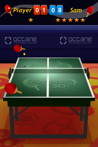
iPingPong 3D
Read on for the full review…
Apple hardware – Love it. Apple software. Love it. Hate it.
A note of interest to committed readers to All About iPhone: I didn’t actually own a Mac until about four months ago. Not that owning a Mac is a prerequisite to owning an iPhone, but the two do go rather well together.
The thing I wanted to talk about here though was my enormous appreciation of Apple’s hardware. Until one owns a Mac or Macbook or iMac or iPhone, you can’t really understand the apparent fanaticism of Apple fans. Yet, once bought – at roughly twice the price of the equivalent spec PC (in the Mac’s case), the difference is obvious. It was like scales falling from my eyes when I handled my first (loaner) Macbook last spring. And then bought my own Mac Mini. And iPod Touch. Apple’s hardware is (more or less) uniformly excellent. With a capital ‘E’.

Mac Mini
Not that their software is shoddy. Oh no, Mac OS X is quite an achievement. As is iPhone OS ( a cut down OS X) in its own quirky little way. But, during compilation of my last Phones Show, it became apparent that, in my eyes at least, there’s something of a disconnect between the flagship excellence of Apple’s hardware and the flagship-wannabe patchiness of their software. But before branding me as a ‘heretic’, read on… (more…)
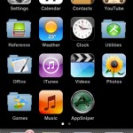
OK, I’m full. Now what? Here’s a suggestion…
I started out well with the AppStore, neatly organising my third party applications into categories: games, utilities, reference, music, and so on. No sweat, I thought. A slight problem when I wanted to get from home screen number 1 to home screen number 9, but at least there’s that handy shortcut (press ‘Home’ again) to get back to screen 1 since the last firmware update (2.2).
Then each category started to fill to overflowing. Meaning that applications spilled out onto the next home screen, polluting it. A month later, I’d reached the point where I’d lost control completely, with the first four applications screens now chock full and no blank ‘slots’ in sight for new apps.
Another month on and all the one hundred and forty-odd app slots are full. And only another 14,950 applications left on the App Store to install. Err……
Read on for an (illustrated!) solution to the problem.
App Review: Talking Phrasebook
I’ve been fascinated by the use of handhelds to facilitate both learning and using languages for years. It all started with the first Psion and Palm PDAs, with appropriate English-to-XXX dictionaries, but with the advent of multimedia around the Year 1997, audio samples became possible for the first time. Space was a problem in those early days, of course. And the underlying platforms have evolved significantly. But the idea is still valid and CoolGorilla’s latest implementation on the iPhone is extremely slick. Here’s a brief video walkthrough of how it works:

